


Coffee table books are one of the few decor objects that do three jobs at once: they add height, they add colour, and they give people something to actually pick up. But the books most of us own were bought to be read, not looked at — and a stack of mismatched paperback spines does more harm to a surface than leaving it empty. Decorative coffee table books are chosen differently, for size, spine colour and proportion first, and subject second. Here is how to pick them and how to display them so they read as intentional rather than as books you happened to put down.
What Makes a Book a Coffee Table Book
A coffee table book is defined by its format rather than its content: large, hardcover, image-led, and printed on heavy paper so it holds its shape when stacked. The subject can be anything — architecture, surfing, a fashion house, a national park — but the proportions are what make it work as an object. A standard novel is roughly 5 by 8 inches and flexible; a coffee table book is usually 10 by 12 inches or larger and rigid enough to support something on top of it. That structural difference is the entire reason one looks styled on a table and the other looks abandoned there.
This also means a book does not need to be expensive to work decoratively. A worn art catalogue from a museum gift shop and a designer monograph do the same visual job if their dimensions and spine colours suit the room.
1. Start With Size, Not Subject
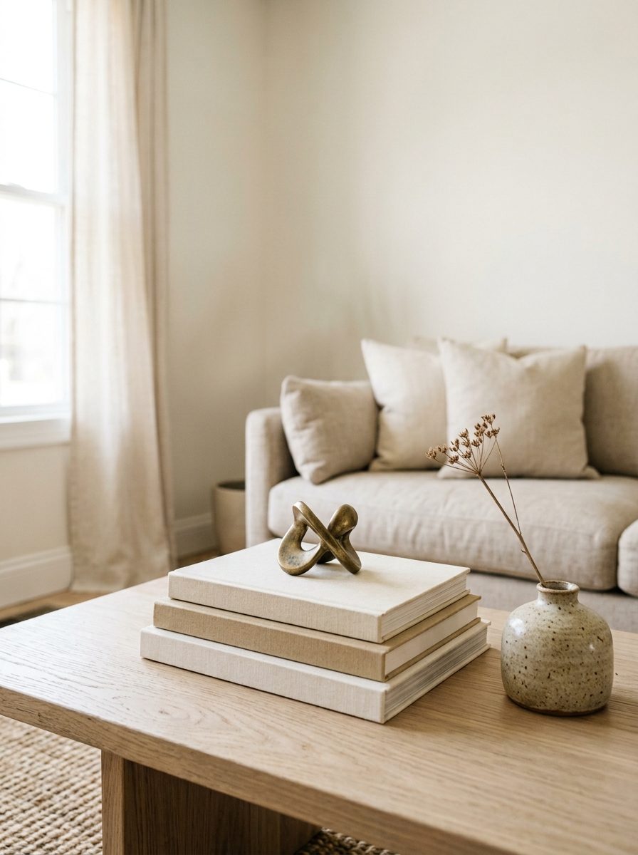
Buy for footprint first. An oversized book — anything from about 12 inches wide up — anchors a surface on its own, which is why a single large book often looks better on a small table than three medium ones. Large-format books also photograph well, which matters if the room ends up on your camera roll or a Pinterest board.
Scale the book to the surface, not to your enthusiasm. On a compact table, one oversized book laid flat with a small object on top reads as deliberate. On a long rectangular table, a stack of two or three plus a second grouping elsewhere fills the space without crowding it. If a book hangs over the edge of the surface or covers more than about a third of it, it is too big for that table.
2. Choose Books by Colour
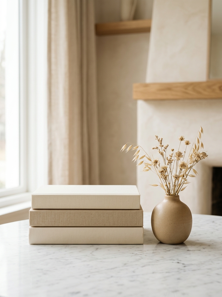
This is the step most people skip. Once a book is closed and stacked, roughly ninety percent of what you see is the spine and the edge of the pages — so spine colour matters more than cover art. Pull three books off your shelf, stack them, and look at them from six feet away: if the spines fight each other, the stack will read as clutter no matter how good the individual covers are.
The safest approach is to pick a narrow palette and repeat it. Neutral books in cream, sand and off-white disappear pleasantly into a soft room and let texture do the work. All-black or all-white spines read as sharp and modern. One saturated colour repeated across two books — the same green, the same navy — works as a deliberate accent, especially if it echoes a cushion or a piece of art already in the room. What rarely works is one of everything.
If your books are the right size but the wrong colour, removing the paper dust jacket often solves it. Publishers frequently bind the boards underneath in plain linen or a single flat colour, which is usually calmer than the jacket printed over it.
3. Build the Stack
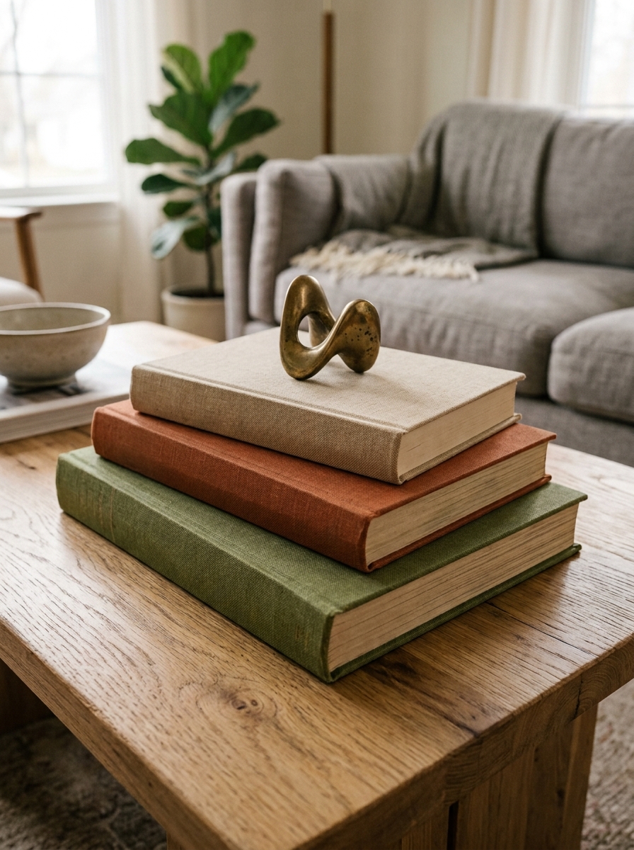
Two or three books is the working number for a stack. One looks incidental, four or more starts to look like storage. Stack them largest at the bottom to smallest at the top so the silhouette tapers — the eye reads that as arranged, while a stack that widens toward the top reads as a pile.
Two refinements make a visible difference. Offset each book by half an inch or so rather than aligning the edges perfectly; a slight rotation keeps the stack from looking like it was measured. And turn at least one book so the pages face out instead of the spine, which introduces a band of clean cream against the spine colours and softens the whole grouping.
4. Mix Stacked and Standing
Books do not have to lie flat. Standing one book upright against a wall or a bookend, cover facing out, turns it into a small piece of art and adds vertical height that a flat stack cannot. This works especially well on a shelf or a console, where you want to break up a long horizontal line.
The combination is stronger than either alone: a flat stack of two providing a low base, and one book standing behind it. That gives you three heights in a single grouping, which is the same principle behind good coffee table styling generally.
5. Use Books as a Pedestal
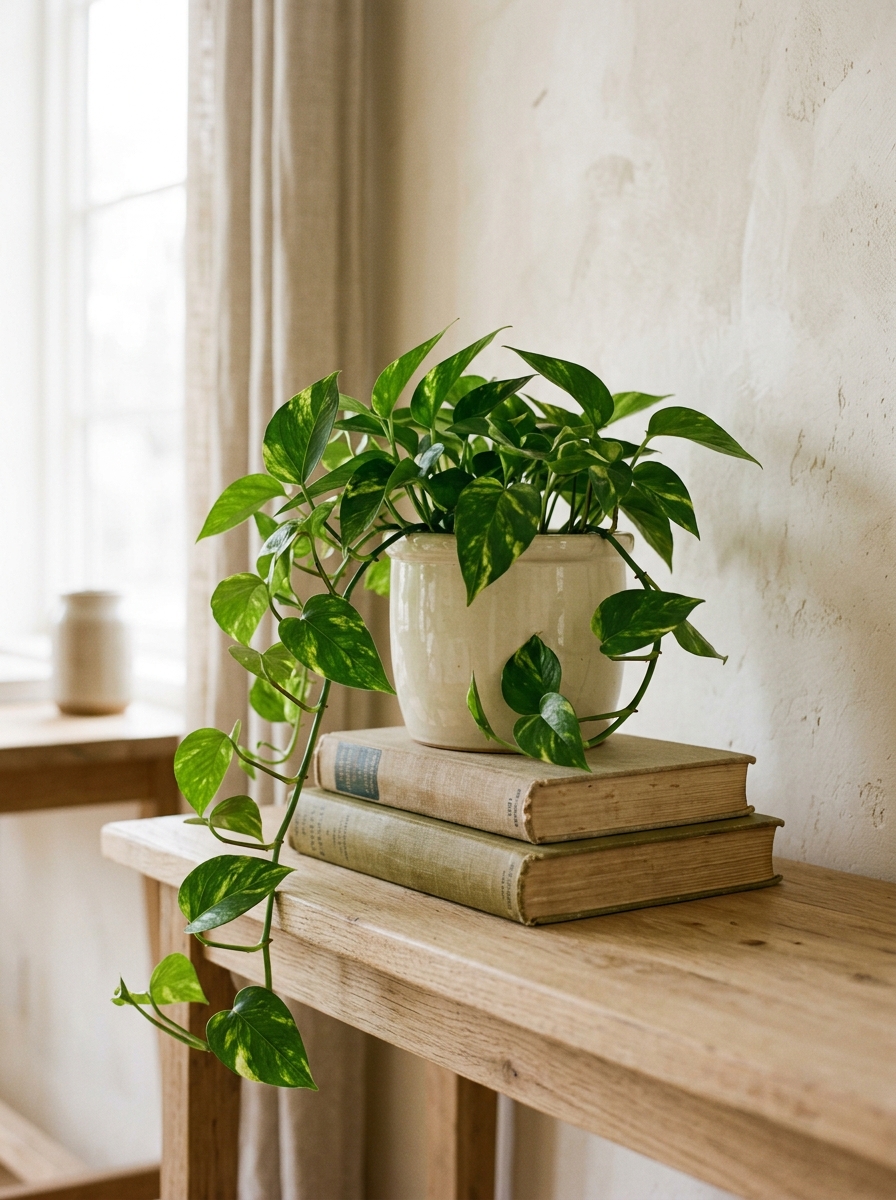
The most useful thing a stack of books does is raise something else. A candle, a small bowl, a stone, a tiny plant — anything short enough to disappear at table height becomes a focal point when it is lifted three inches. This is the fix for a surface where everything is the same height and the whole arrangement looks flat.
Keep whatever sits on top smaller than the top book so it reads as one object rather than two competing ones, and avoid anything that could leak or scratch. A coaster or a small dish underneath a candle protects the cover.
6. Match the Subject to the Room
Subject matters less than format, but it is not irrelevant — it is the difference between decor and a conversation starter. Choose books that reflect something true about the people who live there: the city you keep going back to, the sport you actually do, the photographer whose work you would talk about for twenty minutes. Guests do pick these up, and a shelf of books nobody in the house cares about is obvious.
Subject also gives you an easy way to tie a room together. A book on coastal architecture in a room with linen and pale wood, or a botanical volume in a room full of plants, feels connected rather than random. This is the one place where buying the book you want to read and buying the book that suits the room can be the same decision.
Want the shortcut?
As an Amazon Associate I earn from qualifying purchases. Some links in this post are affiliate links, at no extra cost to you.
Browse current options and prices.
Where Else to Display Coffee Table Books
The name is misleading. Large decorative books work on almost any horizontal surface in the house, and spreading them around is usually better than concentrating them all in one place.
On an Ottoman or Bench
An upholstered ottoman needs a hard surface before it can hold anything. A large flat book — or a tray on top of a book — gives you one, and the book does double duty as decor. Keep the stack low here so the ottoman still reads as seating.
On a Console or Entry Table
A console is narrow, so books work better standing or in a stack of two than in a sprawling arrangement. One upright book beside a lamp and a small dish covers a console end without crowding the walkway, which matters in an entryway where people set keys down.
On Open Shelving
Alternating stacked and upright books across a bookshelf breaks up the rhythm of vertical spines and creates natural places to set an object. Flat stacks also let you fill an awkward shelf that is too short for upright books.
On a Nightstand or Bar Cart
One book on a nightstand raises a lamp or a glass of water to a more comfortable height and looks better than a bare surface. On a bar cart, a single flat book on the lower shelf gives bottles a defined zone instead of letting them slide around.
How Many Coffee Table Books Do You Need
Fewer than most guides suggest. For a single coffee table, two or three is the whole answer. For a living room where books appear on the table, a shelf and a console, six to eight covers every surface with a couple spare to rotate in.
Buying in bulk to fill space is how you end up with a room full of books nobody chose. It is better to own four books you genuinely like the look of and move them around than twenty that came as a job lot. If a surface looks empty, the problem is usually height variation or an ungrouped arrangement rather than a shortage of books.
Decorative Coffee Table Books by Design Style
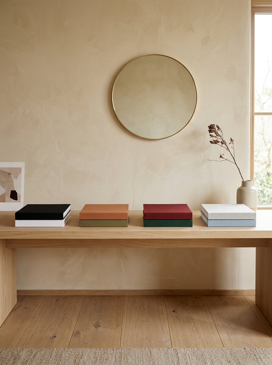
Modern and minimalist. One or two books, matte covers, no dust jackets, in white, black or a single grey. Restraint is the look, so resist adding a third.
Boho. Warmer spines — terracotta, sand, olive — and subjects with some texture to them: textiles, travel, ceramics. Stacks can be looser and more offset here than in a minimalist room.
Traditional. Cloth-bound or leather-look spines in deep green, oxblood and navy, stacked neatly with aligned edges. Symmetry suits this style, so a matching stack at each end of a console works better than one asymmetric grouping.
Coastal and Scandinavian. Pale blues, greys and bleached neutrals, with photography subjects — coastlines, light, architecture. Pair with a light wood tray rather than a dark one so the palette stays cool.
Faux and Blank-Cover Books: Worth It?
Decorative book sets sold purely as props — blank covers, sometimes hollow — solve a specific problem well and a general one badly. They are genuinely useful when you need an exact colour match for a styled shelf, when the books sit somewhere nobody will ever open them, or when weight matters, since hollow versions are far lighter than real hardcovers.
They fall down in the places people actually sit. A guest who picks up a blank book on your coffee table learns something about the room you probably did not intend. If the surface is within reach of a sofa, real books are the better call; save the faux sets for high shelves and staged corners. A middle path that costs almost nothing: buy real secondhand hardcovers and remove the jackets, which gives you honest books in a controlled palette.
Where to Buy Decorative Coffee Table Books on a Budget
New art and photography books are expensive, and there is very little reason to pay full price for something bought largely for its spine.
- Thrift stores and library sales. The single best source. Oversized books are hard to shelve, so they get donated constantly and priced low.
- Museum and gallery gift shops. Exhibition catalogues are large-format, well printed, and often discounted once the show closes.
- Used-book sites. Searching by format rather than title lets you filter for large hardcovers in a price range.
- Estate sales. Reliable for cloth-bound and vintage spines that look collected rather than bought.
- Remainder and outlet sections. Publishers clear oversized stock cheaply because it is costly to store.
The one thing worth paying for is condition. A cracked spine or a water-stained board shows from across the room, and no amount of styling hides it.
Coffee table book styling shopping list
- Decorative books — the base layer of any stack
- Oversized books — anchor a surface on their own
- Decorative tray — contains the grouping
- Bookends — for the upright books
- Small brass object — the thing on top of the stack
- Faux book set — for exact colour matching on shelves
Prices and availability change. Links open on Amazon.
Keeping Them Looking Good
Decorative books live in worse conditions than shelved ones — they sit in direct light, collect rings from glasses, and get moved constantly. Three habits cover most of it. Keep stacks out of direct afternoon sun, which fades spines unevenly and will ruin a matched palette within a year. Always put a coaster or a small dish between a book and anything wet. And rotate which book sits on top every few months, so one cover does not take all the wear and sun while the others stay pristine.
Dust with a dry cloth along the top edge of the pages rather than a damp one, which cockles paper. If a cover does get marked, turning that book so the marked side faces down in the stack buys you a long time.
Mistakes to Avoid
Stacking too many. Four or more books stops reading as decor and starts reading as a place you put books down.
Leaving clashing dust jackets on. The jacket is advertising; the binding underneath is usually the better-looking object.
Ignoring the spines. Choosing books by cover art and then stacking them so only the spines show is the most common reason a stack looks wrong.
Filling every surface. Books on the coffee table, the console, the ottoman and both nightstands is too much of one texture. Let some surfaces do something else.
Buying only for looks. One or two books you would genuinely open keeps the room feeling like it belongs to someone.
Final Thought
Decorative coffee table books work when you treat them as objects with dimensions and colours rather than as reading material that happens to be out. Buy large, keep the palette tight, stack two or three, and use them to lift something else. Do that and a handful of secondhand books will style a room better than a shelf full of new ones.
Frequently Asked Questions
How many coffee table books should you have?
Two or three per surface. For a whole living room, six to eight gives you enough to cover the table, a shelf and a console with a couple spare to rotate. More than that and the room starts to read as storage rather than styling.
What size should a coffee table book be?
Roughly 10 by 12 inches or larger, in hardcover. Anything smaller reads as an ordinary book left out. As a rule, no single book should cover more than about a third of the surface it sits on.
Are faux coffee table books worth it?
They are worth it on high shelves and staged corners where colour matching matters and nobody will open them. On a coffee table within arm’s reach of the sofa, real secondhand hardcovers with the jackets removed give you the same controlled palette without the awkwardness.
How do you display coffee table books without a coffee table?
Stack them on an ottoman under a tray, stand one upright on a console beside a lamp, lay one flat on a shelf to break up vertical spines, or use one on a nightstand to raise a lamp. Any horizontal surface works.
Where can I buy cheap coffee table books?
Thrift stores and library sales are the best source, since oversized books are hard to shelve and get donated often. Museum gift shops discount exhibition catalogues after a show closes, and publishers clear large-format stock through remainder sections.





3 Comments