

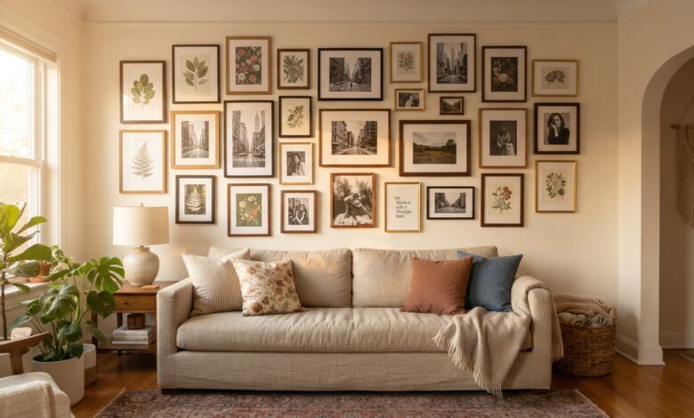
A gallery wall is one of the highest-impact, lowest-cost ways to fill a blank wall with personality, but it’s also one of the easiest things to get visibly wrong. The difference between a gallery wall that looks curated and one that looks like a pile of frames leaning against a surface almost always comes down to planning before a single nail goes in. Here’s how to arrange one like a pro. This guide covers how to arrange a gallery wall step by step, with practical tips and product picks.
As an Amazon Associate I earn from qualifying purchases. Some links in this post are affiliate links, at no extra cost to you.
1. Choose a Layout Style First
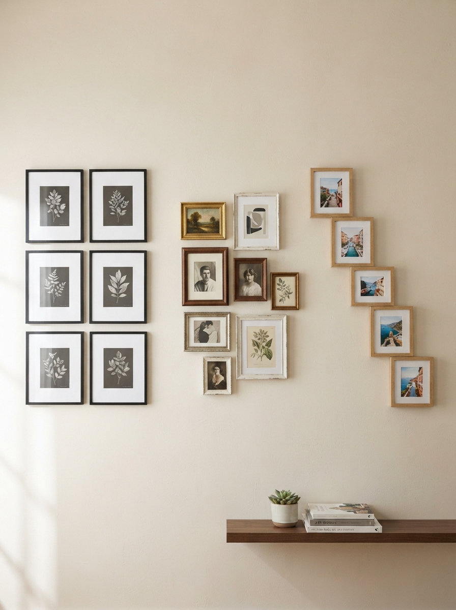
Before picking a single frame, decide whether you want a grid (evenly spaced, matching frame sizes, very structured), an eclectic cluster (mixed sizes and frame styles, looser spacing, more energy), or a linear arrangement (a single row along a staircase or hallway). Each style has a completely different visual rhythm, and mixing approaches within one wall is the single most common reason a gallery wall reads as accidental rather than intentional.
2. Plan on Paper or the Floor First
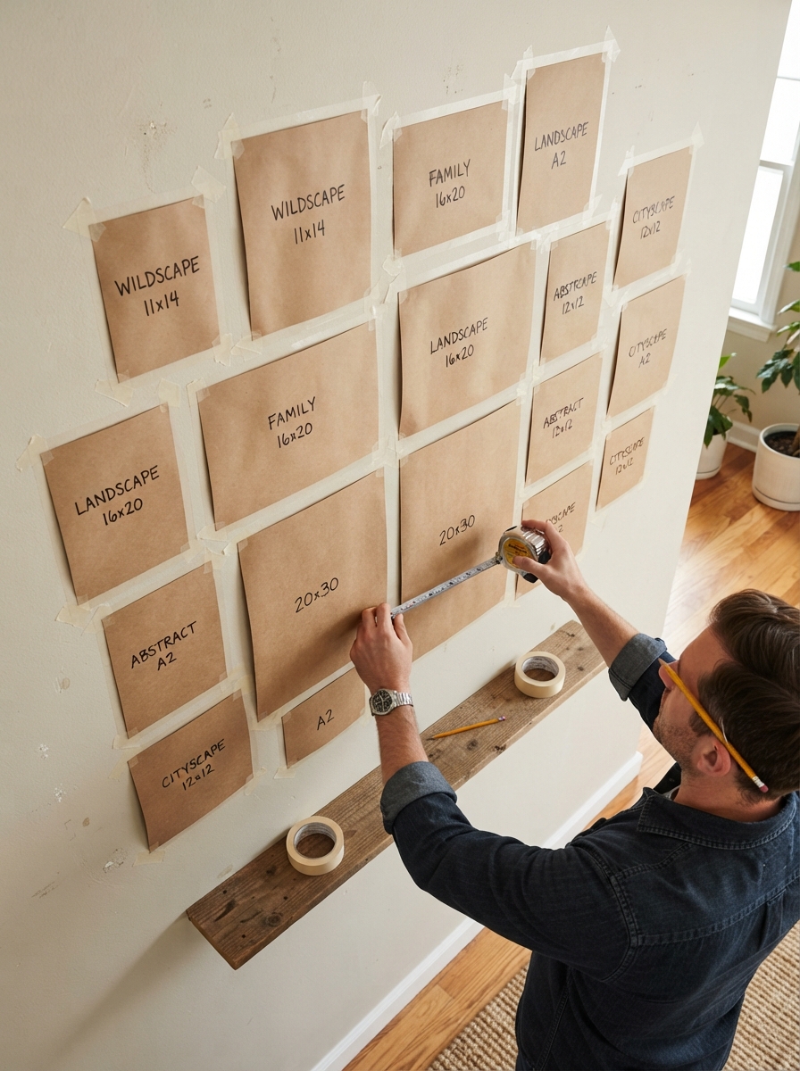
Never start hanging directly on the wall. Trace each frame onto kraft paper and tape the paper templates to the wall to test the arrangement, or simply lay the frames out on the floor in the exact configuration you’re planning. This step alone prevents the most expensive gallery wall mistake — extra nail holes from repositioning frames after the fact.
3. Establish a Unifying Thread
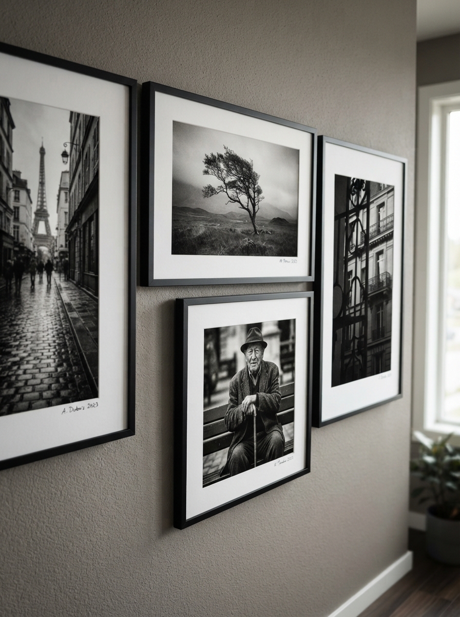
A gallery wall needs one consistent element tying everything together, whether that’s frame color, a shared color palette across the art itself, or a common subject matter (all botanical prints, all black-and-white photography). Without this thread, even beautifully chosen individual pieces can read as a random assortment rather than a considered collection.
4. Mix Frame Sizes, Not Frame Styles
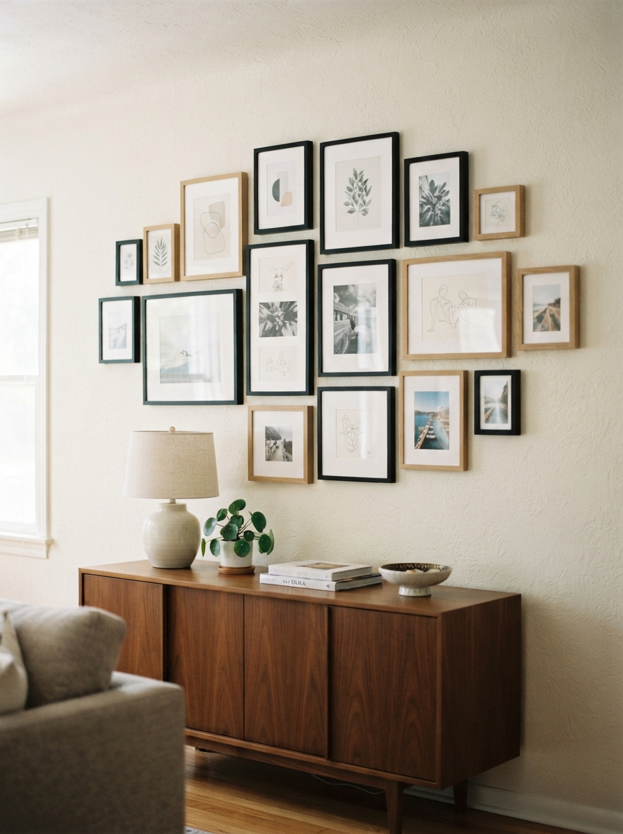
Varying frame sizes creates visual interest and rhythm, but varying frame finishes too much (gold next to black next to natural wood next to white, all in one wall) tends to fight for attention. Pick two frame finishes maximum and repeat them across the collection, which keeps the size variation feeling intentional rather than chaotic.
5. Start From the Anchor Piece
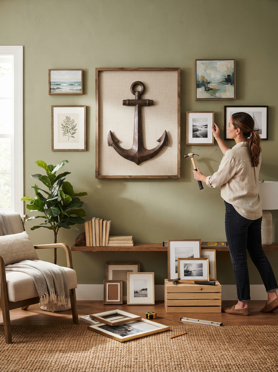
Choose your largest or most important piece first and build outward from it, rather than starting from a corner and hoping it balances out. Position the anchor piece at roughly eye level (57–60 inches to the center of the piece is the standard gallery rule), then arrange supporting pieces around it.
6. Keep Spacing Consistent
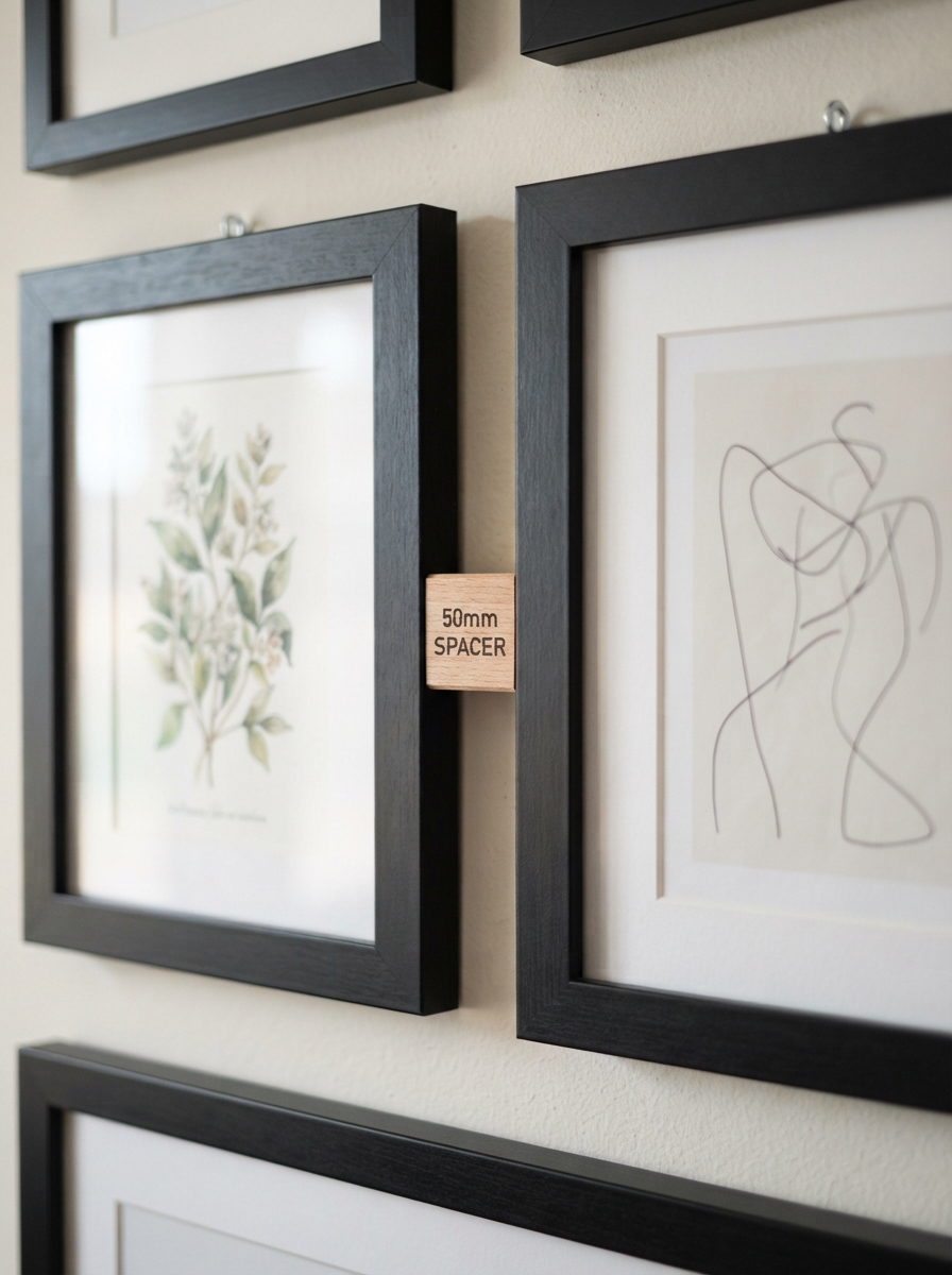
2 to 3 inches between frames reads as intentional; anything tighter looks cramped, and anything looser starts to look like separate, unrelated groupings rather than one wall. Use a spacer tool or a folded piece of cardstock cut to the exact gap width to keep spacing uniform as you hang each piece.
7. Don’t Forget Negative Space
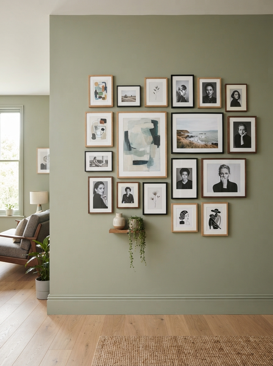
A gallery wall doesn’t need to fill every inch of the wall. Leaving breathing room around the overall composition — not just between individual frames — keeps the arrangement from overwhelming the room, especially above a piece of furniture where the wall grouping should relate proportionally to what’s beneath it. Related reading: wall art arrangement tips every homeowner should know.
Gallery Wall Layout Templates
The Grid
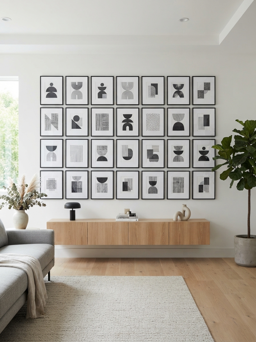
Identical or near-identical frame sizes arranged in even rows and columns with consistent spacing throughout. This is the most forgiving layout for beginners since the math does most of the visual work, and it suits a modern or minimalist room especially well.
The Salon-Style Cluster
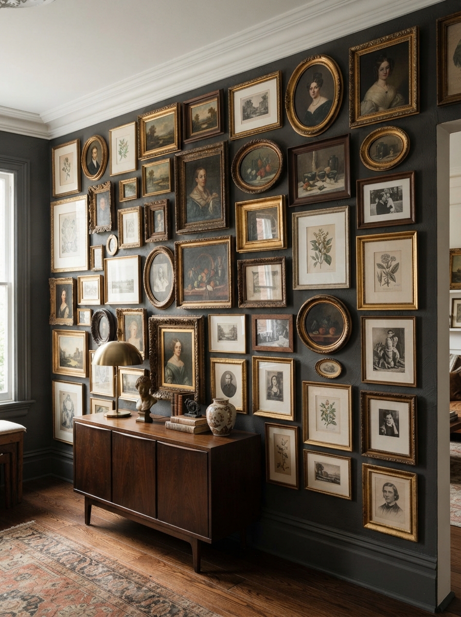
A dense, eclectic mix of sizes and frame styles filling an entire wall edge to edge with minimal negative space between pieces. This traditional European approach works best when you already have a large, varied collection of art and want to display all of it rather than editing down.
The Staircase Line
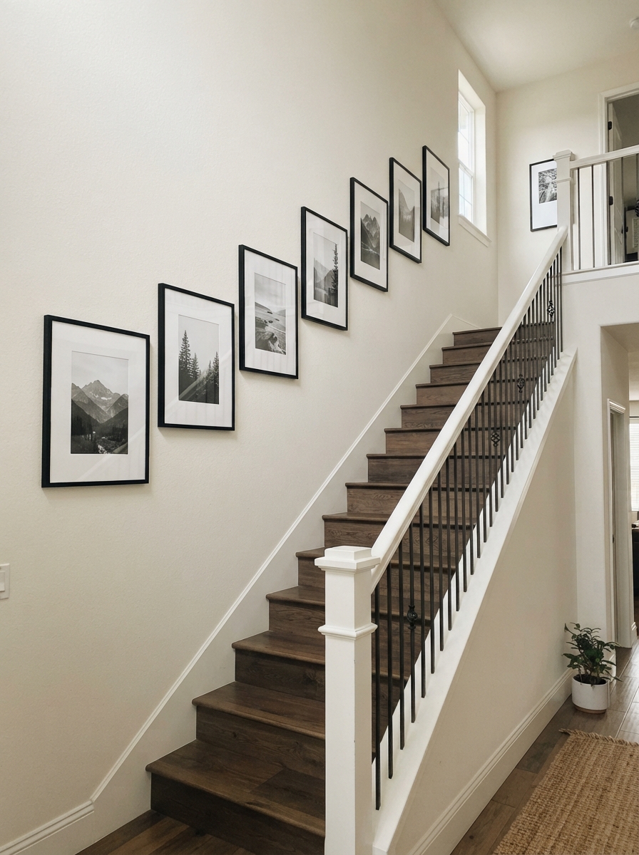
A single row of frames following the angle of a staircase, spaced evenly and centered on the same sightline. Keep frame sizes similar for this layout, since dramatically different sizes break the visual line the eye is meant to follow up the stairs.
The Asymmetrical Cluster
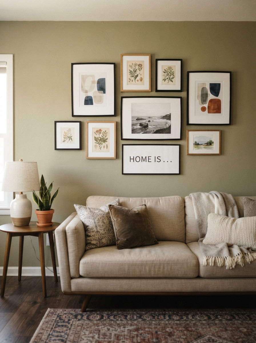
A mix of two or three sizes arranged with intentional, uneven spacing that still reads as balanced overall — the most versatile layout for most rooms, since it has enough structure to look planned but enough looseness to feel collected over time rather than bought as a set.
What to Include Beyond Framed Prints
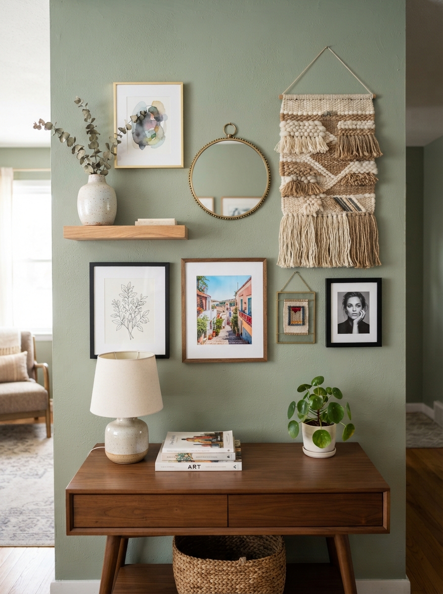
A gallery wall doesn’t have to be exclusively flat framed art. Mirrors add depth and reflect light back into the room, breaking up a wall of otherwise flat surfaces. A small shelf mounted within the arrangement gives you a spot for a small plant or ceramic object, adding a three-dimensional element the rest of the wall lacks. Textiles — a small framed fabric swatch, a woven wall hanging, or a piece of embroidery — introduce texture that flat glass-covered prints can’t provide on their own. Mixing in one or two of these non-print elements is often what separates a gallery wall that feels personally collected from one that feels purchased as a matching set.
Choosing Art for Your Gallery Wall

You don’t need original paintings or expensive prints to build a compelling wall. Family photographs printed in black and white create instant cohesion regardless of when or where they were taken. Postcards and museum prints from travel are inexpensive and carry genuine personal meaning. Children’s artwork, framed simply and consistently, holds up surprisingly well as gallery wall content and ages better than most decor trends. Botanical illustrations, vintage book pages, and even fabric swatches from a favorite textile all work as long as they share the unifying thread established earlier — color, subject, or frame style.
Ready to start hanging?
Frame sets, ledges and hanging hardware in one place.
Gallery Wall Ideas by Room
Living Room
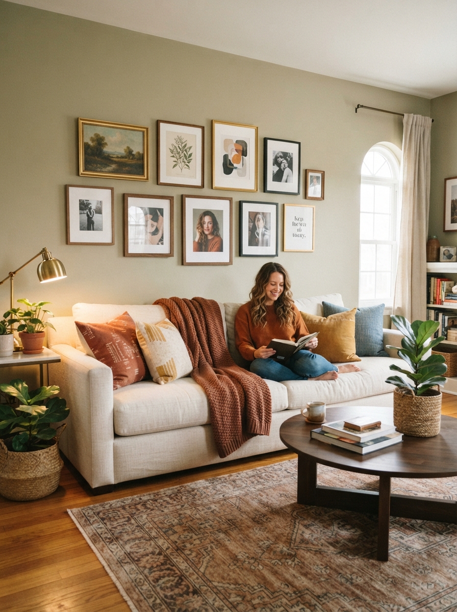
The space above a sofa is the most common gallery wall location, and the arrangement should span roughly two-thirds the width of the sofa below it for proper proportion. A mixed-size asymmetrical cluster works especially well here since it draws the eye without competing with other focal points in the room.
Staircase
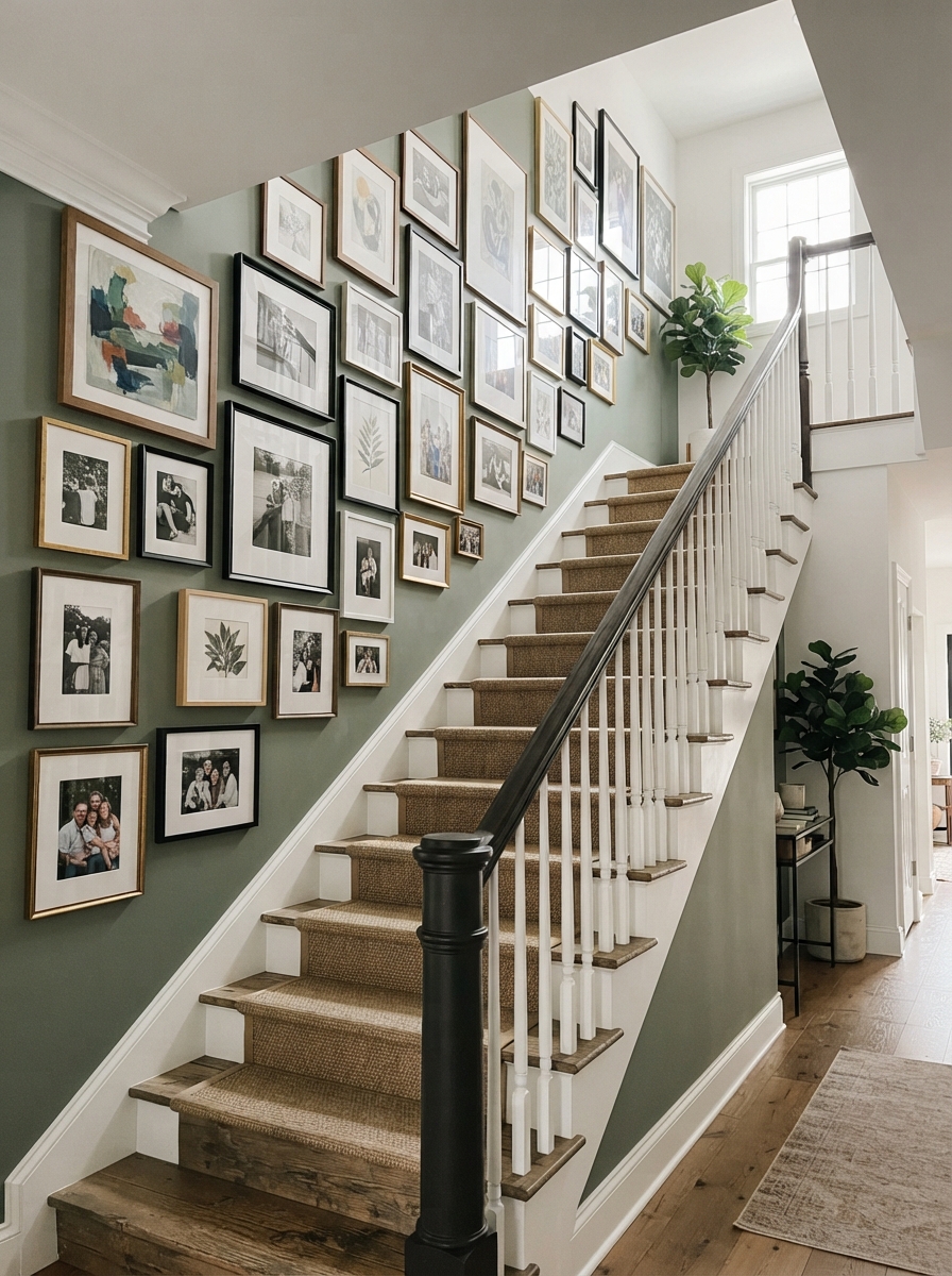
A linear row following the stair angle makes the most of an otherwise awkward, narrow wall. Keep the bottom frame roughly at the height of the lowest stair tread and let the row climb consistently from there.
Bedroom
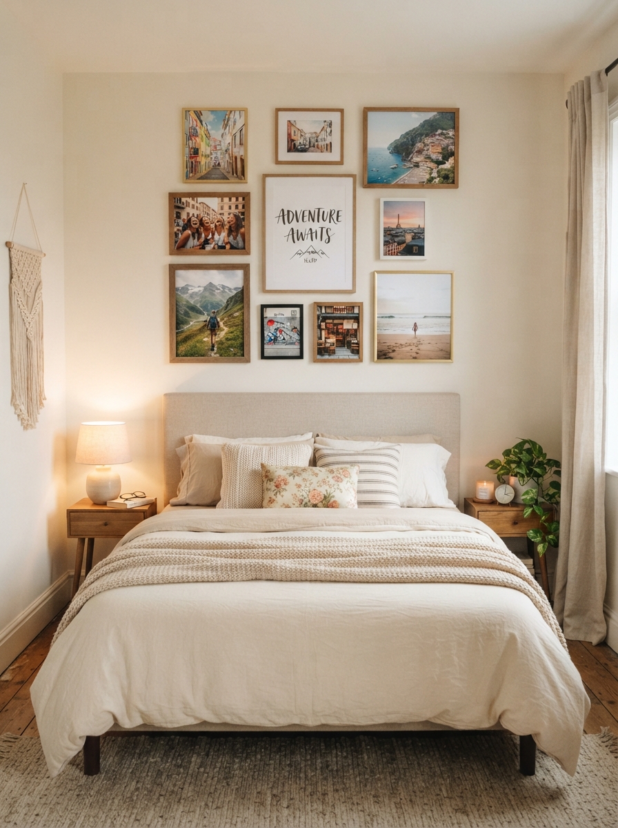
A softer, more personal collection — travel photos, a wedding invitation, a favorite quote print — suits a bedroom gallery wall better than the bolder graphic choices that work in a living room. Center the arrangement above the headboard, keeping the total width close to the width of the bed.
Hallway
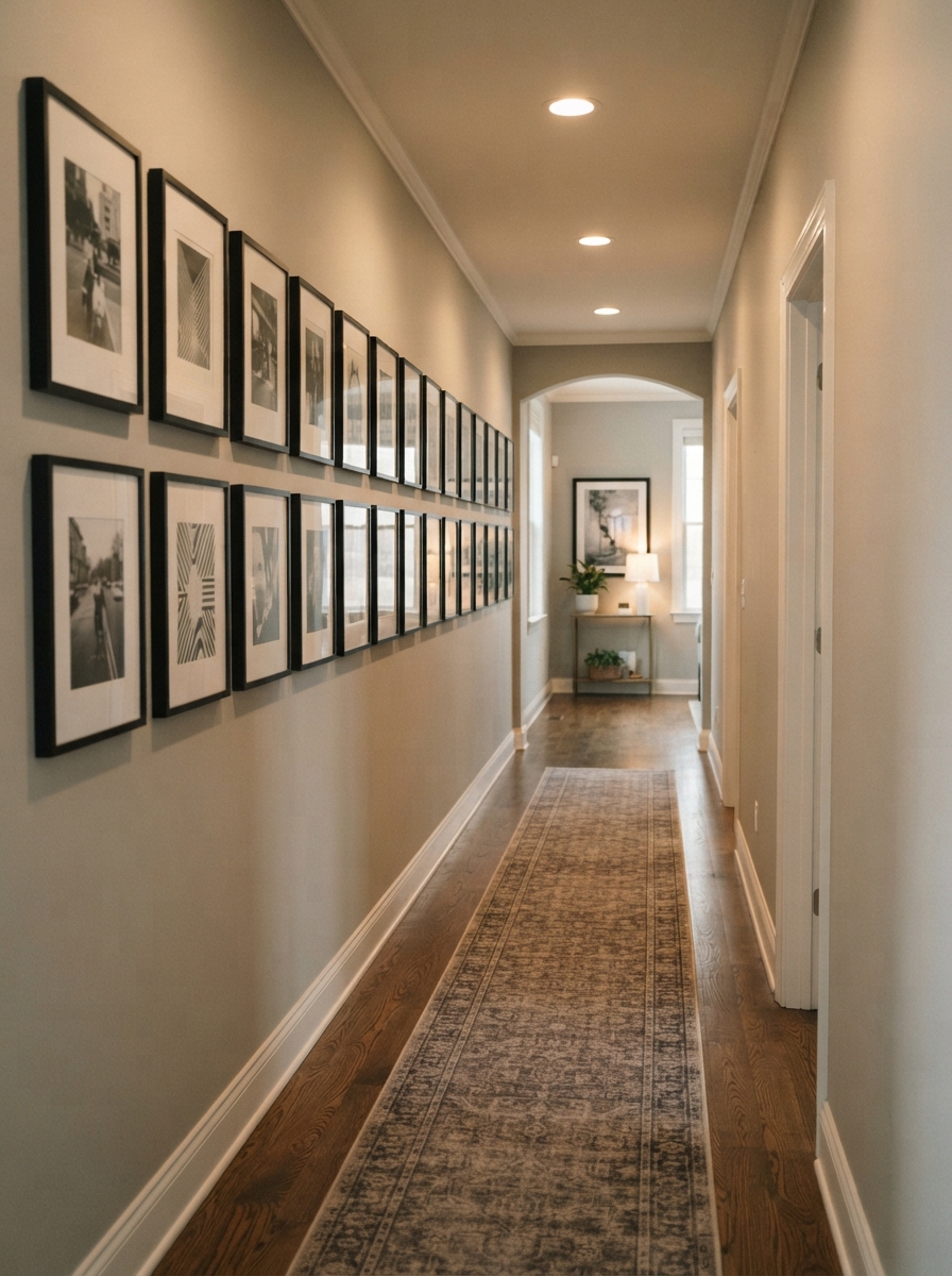
A long, narrow hallway suits either a single linear row at consistent height or a series of smaller clusters spaced evenly along the wall’s length, giving visitors something to look at as they pass through rather than a blank corridor.
Tools and Supplies for Hanging a Gallery Wall

A basic hanging kit makes the process considerably easier: a laser level for keeping rows straight, painter’s tape for marking planned positions before committing to a nail, a picture-hanging hook set rated for the weight of your heaviest frame, and a stud finder if you’re hanging anything substantial. Command strips work fine for lightweight frames in rental-friendly setups, though they’re less reliable for anything over a few pounds. Keep a small notebook or take a photo of your finalized floor layout before hanging, so you have a reference if a frame needs to come down and go back up in the exact same spot.
Budget-Friendly Gallery Wall Ideas
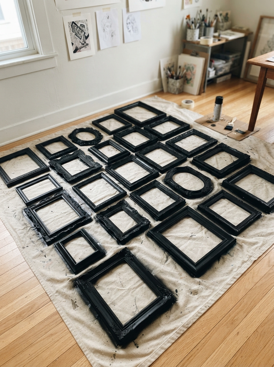
A gallery wall can look considered without a large budget behind it. Thrifted frames, given a matching coat of spray paint, unify a mismatched collection for the cost of a single can of paint. Printing your own photos at a drugstore kiosk costs a fraction of custom framing and lets you build a personal collection quickly. Free printable art — botanical illustrations, vintage maps, and public-domain paintings are widely available online — fills frames with genuinely attractive content at no cost beyond printing. Buying frames in bulk from a budget retailer, all in the same one or two finishes, solves the frame-matching problem and the cost problem in a single purchase.
Digital Planning Tools

Beyond the traditional paper-template method, several free apps let you photograph your wall and digitally place frame outlines to preview a layout before committing to measurements. This is especially useful for a grid layout, where precise, even spacing matters more than in a looser eclectic cluster. Even without an app, taking a photo of your blank wall and sketching frame placement directly on the photo (digitally or by printing it out) achieves a similar preview effect and helps catch spacing issues before they become nail holes.
Gallery wall shopping list
- Picture frame set — matching frames for a grid layout
- Picture hanging strips — renter friendly, no nails
- Laser level — the tool that keeps rows straight
- Picture ledge shelf — for leaning arrangements
- Picture hanging kit — hooks, nails and wire in one
- Art prints — fill gaps without originals
Prices and availability change. Links open on Amazon.
Common Gallery Wall Mistakes to Avoid
A few habits undercut an otherwise well-planned gallery wall. Hanging pieces too high is the single most common error — most galleries hang art with the center around 57 to 60 inches from the floor, well below where instinct tends to place it. Skipping the planning step and hanging directly on the wall leads to unnecessary holes and a layout that often looks worse than what was originally imagined. Mixing too many frame finishes fights for attention rather than reading as eclectic. And choosing art purely because it fits the space, rather than because you genuinely like it, results in a wall that looks fine but says nothing about the room or the people living in it.
Renter-Friendly Gallery Wall Options
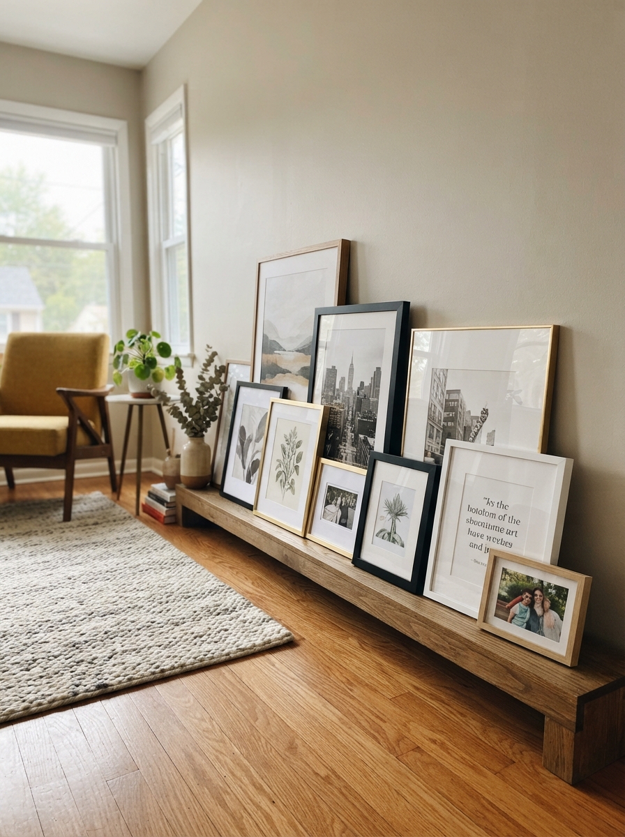
A gallery wall is entirely achievable without putting a single hole in a rental wall. Adhesive picture-hanging strips rated for the frame’s weight hold securely and remove cleanly, and a leaning arrangement on a floor ledge or shelf achieves a similar layered look without any wall damage at all. A large piece of pegboard, painted to match the wall and mounted with removable adhesive hooks, can hold an entire rotating collection of small frames and art without a single traditional nail hole. When you move, the whole leaning or pegboard arrangement travels with you exactly as configured.
Final Thought
A great gallery wall comes down to planning before hanging, choosing a unifying thread, and resisting the urge to fill every available inch. Take the extra hour to map it out on the floor first, and the arrangement will read as considered rather than accumulated — a wall that clearly took time is one people will actually stop and look at.
Frequently Asked Questions
How high should a gallery wall be hung?
The center of the overall arrangement should sit around 57 to 60 inches from the floor, which is the standard eye-level height used in galleries and museums, regardless of ceiling height in the room.
How much spacing should be between frames?
2 to 3 inches between frames is the standard that reads as intentional; tighter spacing looks cramped and wider spacing can make the grouping look like separate, unrelated clusters instead of one composition.
Do all the frames need to match?
No — in fact, varying frame sizes creates helpful visual rhythm. The key is limiting frame finishes to one or two consistent colors or materials so the size variation still reads as cohesive.
Can I create a gallery wall without hanging any nails?
Yes — adhesive picture-hanging strips, a leaning floor ledge arrangement, or a painted pegboard with removable hooks all achieve the look without permanent wall damage, making the approach fully renter-friendly.
How many pieces do I need for a gallery wall?
There’s no fixed number, but five to nine pieces is a common range for a single cohesive wall — enough to create real visual interest without needing an entire art collection to get started, though a large accent wall can comfortably hold more once you’re confident in the layout.
Should a gallery wall be centered above furniture?
Yes — center the overall arrangement horizontally above the piece of furniture beneath it, and aim for the total width of the grouping to span roughly two-thirds the width of that furniture piece for the most balanced proportion.



5 Comments