
As an Amazon Associate I earn from qualifying purchases. Some links in this post are affiliate links, at no extra cost to you.
You’ve bought the furniture. You’ve spent hours scrolling inspiration boards. You’ve rearranged the living room twice. And yet something about the space still feels flat, disconnected, or like it belongs in a catalog rather than a home you actually want to spend time in. That frustration is more common than most homeowners realize, and it almost never comes down to how much money you’ve spent. The truth is, affordable interior design isn’t about spending less, it’s about spending smarter, guided by the same principles professional designers use on every project.
The gap between rooms that look polished and rooms that don’t isn’t a budget gap. It’s a knowledge gap. Professional designers don’t work with limitless resources; they work with a set of principles that make every decision easier and every dollar go further. Those principles are color, scale, layering, and focal points. They apply whether you’re refreshing a studio apartment or redecorating a four-bedroom house from scratch. More on that in 35 aesthetic bedroom ideas for every style & budget.
At Aesthetic Nest Decor, these are the principles we break down room by room, from bedrooms to balconies, specifically for people who’d rather figure this out themselves than hire a designer. This guide walks through each one in plain terms, with real applications you can start this week. But that starts with understanding what most homeowners get wrong before spending a single dollar.
Why your budget isn’t the problem (your framework is)
The real reason rooms feel unfinished
Most homeowners shop for furniture the same way they shop for groceries: one item at a time, based on what looks good in isolation. A sofa from one store, a rug from another, a coffee table because it was on sale. The room accumulates pieces, but it never gels. This isn’t a spending problem; it’s a sequencing problem. Without a guiding framework, even a $10,000 furniture budget produces a room that feels assembled rather than designed. This is exactly where budget-friendly decorating ideas fall apart, not because of the price tags, but because there’s no plan holding the pieces together.
If you are still finding your footing, start with the fundamentals in our 11 interior design rules every beginner should know.
What professional designers actually do differently
Designers don’t have access to a secret budget that you don’t. They have a process. They solve color first, then scale, then layering, then focal points, in that order, and every purchase decision is filtered through that sequence. The result looks expensive because it’s coherent, not because each piece costs more. This is a repeatable system, and you don’t need to outsource it to anyone, including a virtual interior designer.
How much you actually need to spend to see real change
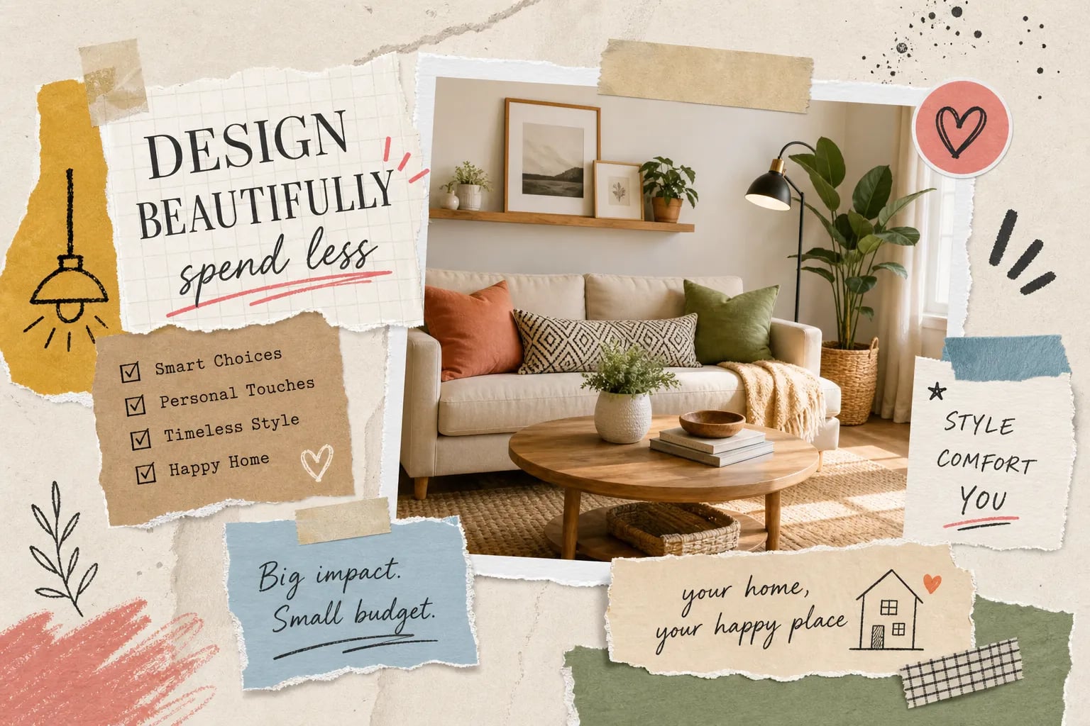
Paint runs $30 to $60 a gallon. Hardware swaps come in well under $100 for most rooms. A well-placed rug or a set of textured throw pillows can cost less than dinner for four at a mid-range restaurant. The four principles below require an investment of attention, not necessarily cash. Start there before opening your wallet for anything new.
Affordable interior design starts with color: the highest-return move in any room
Choosing a palette that works with your existing pieces
The 60-30-10 rule is the clearest framework for building a room’s color palette. Sixty percent goes to your dominant color, typically walls or your largest piece of furniture. Thirty percent goes to a secondary color: accent furniture, rugs, or curtains. Ten percent goes to a high-contrast pop through pillows, art, or small accessories. A practical example: soft warm white walls at 60%, a taupe sofa and curtains at 30%, and deep blue cushions and artwork at 10%.
The good news is you probably don’t need to buy anything new to apply this framework. Often, rearranging or repainting what you already own is enough to get your palette right, pull out pieces that compete with your dominant color, store them, and let the palette breathe. This is one of the fastest budget interior design moves available to any homeowner, regardless of square footage.
How undertones and natural light change everything
A paint color that looks perfect on a chip at the hardware store can wash out or clash completely once it’s on your walls. Warm undertones, creamy whites, soft taupes, warm grays, work best in north-facing rooms that get less direct sunlight. Cool undertones handle south-facing rooms with strong light exposure much better. Always test paint samples directly on the wall and observe them at different times of day before committing to a full gallon.
Where paint delivers the most impact for the least cost
Walls get most of the attention, but painting a ceiling, cabinet faces, or a single accent wall delivers outsized visual change for minimal cost. A deeper shade on one wall immediately creates a focal anchor for the entire room. For good reason, fresh paint remains the highest-impact, lowest-cost update most homeowners can make, and that reputation is well earned. As a first step in any affordable home decorating project, it’s hard to beat a well-chosen gallon of paint.
Scale and proportion: why your furniture arrangement feels “off”
The most common scale mistake homeowners make
Furniture that’s too small for a room creates a cluttered, disconnected look, pieces floating in space with no relationship to each other. Furniture that’s too large makes a room feel oppressive and hard to move through. Both problems share the same root cause: buying pieces in isolation rather than in relation to the room’s actual dimensions. A sofa that reads beautifully on a showroom floor may be completely swallowed by a 20×15 living room, or overwhelm a studio apartment.
Always measure before you buy. Write down your room’s dimensions and the dimensions of any prospective piece before you step foot in a store or add something to an online cart. Skipping this step is one of the most expensive mistakes in budget interior design, you end up returning things, or worse, keeping pieces that never quite fit.
How to evaluate scale without an architecture degree
Before purchasing a new piece of furniture, tape off its footprint on the floor using painter’s tape. If it reads correctly in the room, it will read correctly once assembled. For proportions between pieces, a few general rules hold consistently: rugs should extend at least six inches beyond the sofa on each side, and coffee tables should sit within two inches of the sofa seat height. These aren’t arbitrary guidelines, they create the visual continuity that makes a room feel intentional rather than accidental.
Rescaling what you already own before buying anything new
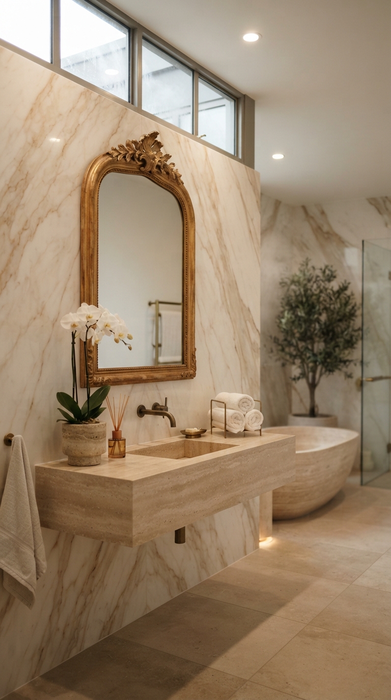
Rearranging existing furniture, removing one oversized piece, or swapping a heavy coffee table for a lighter-framed one can visually reset a room without spending anything. Layout adjustments account for a significant portion of what makes professionally designed rooms feel polished. Before you buy anything, try subtracting something first.
Layering textures and materials for a room that has depth
What “layering” actually means in everyday design terms
Layering is the practice of combining materials with different visual and tactile qualities in the same space: smooth against rough, matte against shiny, soft against rigid. A room furnished entirely in one texture reads as flat and staged, even when the individual pieces are attractive. The contrast between materials is what creates the lived-in richness that makes a space feel finished rather than assembled from a single catalog page.
Affordable interior design layering: how to build depth on a real budget
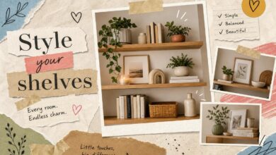
Start with the largest surface layer, typically a rug or bedding, and establish the room’s primary texture there. Then add mid-layer softness through throw pillows, curtains, or a blanket draped over a chair. Finish with small hard accents that contrast with the softness around them: a ceramic vessel, a woven basket, a metal tray placed on a stack of books. This sequence builds depth without overwhelming the room or requiring high-end pieces at every layer.
For sourcing on a tight budget, thrift stores, discount home sections at larger retailers, and even kitchen supply stores regularly carry texture-rich accessories at a fraction of boutique prices. A $12 woven basket from a discount bin contributes as much visual texture as one from a specialty shop at four times the cost. This kind of cheap room makeover thinking, substituting smart sourcing for a bigger budget, is what separates good affordable home decorating from random accumulation. More on that in Home coffee bar setup.
Common layering mistakes that make rooms look cluttered, not curated
More is not always more. Layering works best when each piece brings a distinct texture that contrasts with its neighbor, not when every surface is simply covered. A practical editing rule: if you can’t clearly identify what a specific object contributes to the room’s texture story, remove it. What remains will do its job more effectively with fewer pieces competing for attention.
Focal points: how to anchor a room and give it purpose
Why every room needs one dominant visual anchor
A focal point is the first thing your eye lands on when you enter a room. Without one, the eye wanders from surface to surface and the space feels restless, regardless of how well-furnished it is. Rooms with natural focal points, fireplaces, large windows, or architectural details, have an obvious starting point for the eye. Rooms without those features need one built deliberately.
Budget-friendly ways to create a focal point from scratch
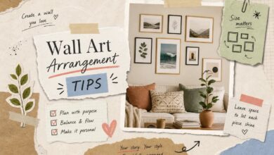
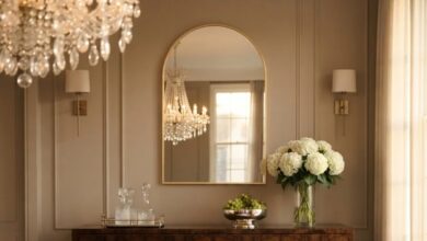
A single large piece of art or a gallery wall above a console table anchors a living room effectively. A statement headboard or an oversized mirror does the same for a bedroom. Both approaches cost a fraction of architectural renovations and achieve the same visual result. Paint is also a tool here: a single wall painted in a deeper shade or a contrasting color immediately draws the eye and gives everything else in the room something to organize around.
What to do when your room has too many competing focal points
When a large TV, a bold patterned rug, and a gallery wall all occupy the same sightline, nothing stands out because everything is competing for dominance. Solving this is usually a subtraction exercise, neutralize one or two of the competing elements with muted colors or repositioning, and let one clear winner take the lead. The room will feel more intentional immediately, even without adding a single new piece.
Putting these principles together, room by room
How the sequence changes depending on the space
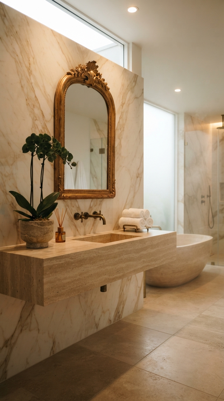
In a bedroom, color and focal point do the heaviest lifting. In a living room, scale and layering matter most. In a compact kitchen or studio apartment, all four principles need to work simultaneously to avoid a cramped, visually noisy result. The principles themselves don’t change from room to room, but their priority order shifts based on the room’s function and square footage. Knowing which principle to lead with in a given space is what separates a coherent room from one that’s just busy.
Where to start when you’re tackling the whole home
Don’t attempt every room at once. Pick the room you spend the most time in, apply these four principles in sequence, and use that room as your confidence-builder before moving through the rest of the house. A phased approach also gives you a chance to see what works and refine your eye before committing to larger purchases in other rooms. One room done well teaches you more than five rooms done halfway.
How Aesthetic Nest Decor takes these principles further
Once these principles click conceptually, applying them in specific rooms becomes the real work. Aesthetic Nest Decor publishes room-by-room design guides that walk through exactly how to execute color, scale, layering, and focal points in spaces like bedrooms, entryways, balconies, and compact kitchens. Each guide is written for people who are doing this themselves on a realistic budget, not staging a showroom. If you’re ready to move from principles to a specific room, those guides are the natural next step.
The real definition of budget-friendly design
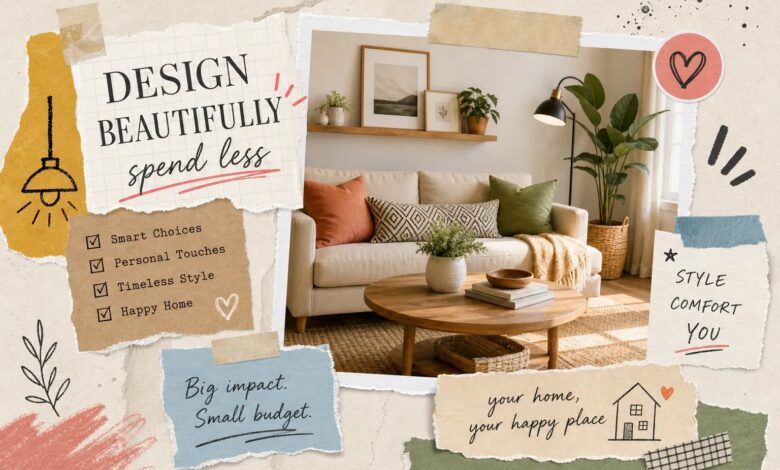
Decorating on a budget isn’t about finding the cheapest possible version of something. It’s about knowing which decisions matter most and making those well before spending anything on the rest. Color, scale, layering, and focal points are the decisions that matter most, and none of them require a large budget to execute correctly.
Work through the sequence: start with color, evaluate your scale, build in texture through layering, then establish one clear focal point per room. Each principle reinforces the others, and the cumulative result looks far more intentional than any collection of well-priced individual purchases ever could. That’s the real promise of affordable interior design, a cohesive, livable home built on good decisions, not a bigger budget.
Pick one room. Apply one principle this week. You don’t need a renovation timeline or a larger budget to start seeing a real difference. When you’re ready to go deeper into a specific space, Aesthetic Nest Decor’s room-by-room guides are there to walk you through every step, and put these affordable interior design principles to work in your actual home. See also: Home library design ideas for every space and style.