

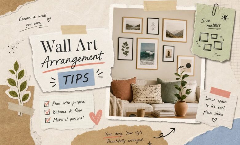
You finally find the perfect frame, hang it on the wall, and step back to discover it looks completely lost. It’s too high, too centered, or dwarfed by empty space on every side. Maybe you’ve tried a gallery wall before and ended up with a cluster of frames that looks more like a storage situation than a styled arrangement. That frustration is one of the most common things readers bring to Aesthetic Nest Decor: when it comes to wall art arrangement, where do you even start when you want to fill a wall without making it look chaotic?
The good news is that arranging wall art isn’t an instinct you either have or don’t. It’s a skill with specific, repeatable rules. Once you understand spacing, layout selection, pre-planning with paper templates, hardware matching, and digital visualization, you can hang anything from two frames to fifteen with confidence. This guide walks you through every step of that process. If you want to go further, 11 interior design rules every beginner should know covers it in detail.
Want the shortcut?
As an Amazon Associate I earn from qualifying purchases. Some links in this post are affiliate links, at no extra cost to you.
Frame sets, hanging hardware and levels in one place.
Check price on Amazon →The spacing rules that anchor any good wall art arrangement
How many inches between frames actually matters
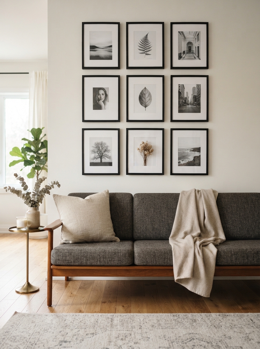
The standard spacing for most gallery walls falls between 2 and 3 inches, and that range works for the majority of arrangements. Small frames in the 5×7 to 8×10 inch range look best at 1.5 to 2 inches apart, while larger pieces in the 16×20 to 18×24 inch range can handle 3 to 4 inches without losing the visual connection between them. For a looser, more decorative picture wall layout in a large room, 4 to 6 inches between frames creates an airy feel that lets each piece breathe.
The exact number matters less than your commitment to it. Pick a gap and repeat it throughout the entire arrangement. An imperfect layout with consistent spacing reads as intentional; a technically “perfect” composition with random gaps reads as careless.
The furniture clearance rule most people ignore
When hanging art above a sofa, console table, or bed, leave 6 to 10 inches between the top of the furniture and the bottom edge of the lowest frame. Tighter than 6 inches makes the art and furniture look disconnected rather than paired, like two unrelated objects sharing a wall. For a single statement piece hung solo, centering it at 57 to 60 inches from the floor puts it at standard eye level, which is the starting point most interior designers use before adjusting for specific rooms. Related reading: interior design tips.
Why consistency beats perfection
Beginners often agonize over getting the layout “just right” before touching a nail. A more useful approach: cut a scrap piece of cardboard to your chosen spacing measurement and use it as a physical spacer between frames as you hang. That one tool eliminates most spacing errors and keeps the arrangement cohesive from the first frame to the last.
Matching your wall art arrangement to your wall size
Small walls (24, 48 inches wide): keep it simple
Small walls benefit from restraint. A two-piece diptych or three-piece triptych with frames in the 8×10 to 11×14 inch range fills the space without overwhelming it. A centered anchor piece flanked by 2 to 4 smaller frames also works well when you want a layered look without crowding. Negative space is part of the composition, not wasted wall. Cramming too many frames onto a compact wall makes the arrangement feel cluttered rather than styled.
Medium walls (48, 72 inches wide): grids and anchor clusters
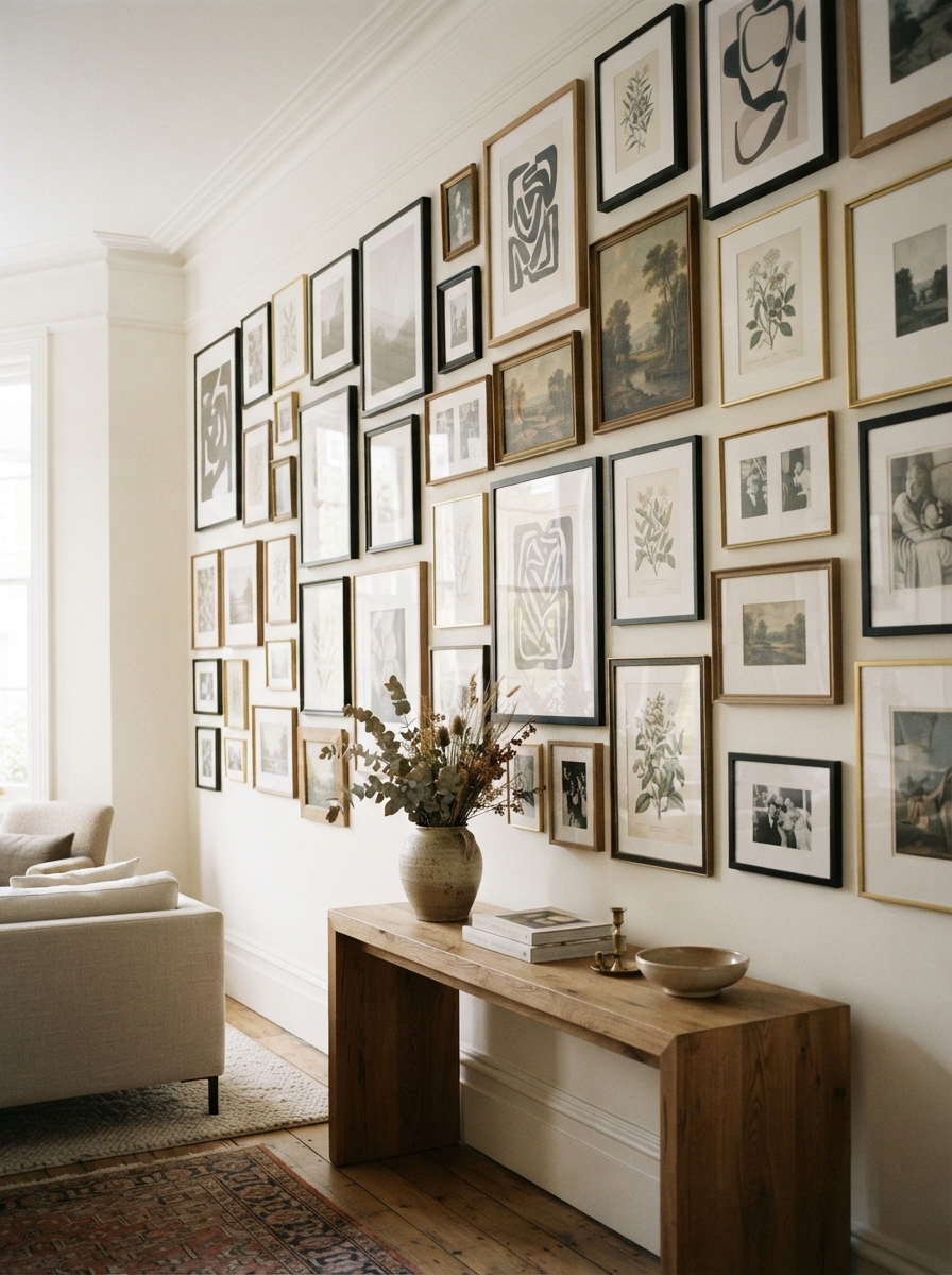
Medium walls give you more flexibility. A 2×2 or 3×3 grid with uniform frames creates a clean, organized look that works especially well in modern or minimalist spaces. The anchor-plus-cluster layout, one larger piece surrounded by 4 to 6 smaller frames, suits the space above a sofa or console beautifully. As a sizing rule, the total grouping should span roughly two-thirds of the furniture’s width below it. This keeps the art visually connected to the furniture rather than floating independently.
Large walls (72 inches and wider): when to go salon-style
Large walls can carry a salon-style or organic cluster arrangement with 10 to 15 mixed frames. A 4×3 grid works well above a long sofa or in an open-plan room where the wall spans a significant stretch. On any large wall, start with an anchor piece to establish the visual center before adding surrounding frames. Without that anchor, large arrangements often end up with an unclear focal point and an unbalanced feel.
 Collage SetPicture Frames Collage Wall Decor, Gallery Wall Frame Set★★★★½ 4.6 (893)Check price on Amazon →
 12×12 Set of 912×12 Picture Frame Set of 9, Display 8×8 with Mat★★★★☆ 4.3 (844)Check price on Amazon →
 Solid Wood11×14 Picture Frame Black, Solid Wood 3 Pack with Clear Glass★★★★½ 4.6 (648)Check price on Amazon →
 Black Wood11×14 Picture Frame 3 Pack, Black Wood, Real Glass★★★★½ 4.5 (563)Check price on Amazon →
Prices and availability change on Amazon. As an Amazon Associate I earn from qualifying purchases.
Planning your wall art arrangement before a single nail goes in
The paper template method: trace, cut, label
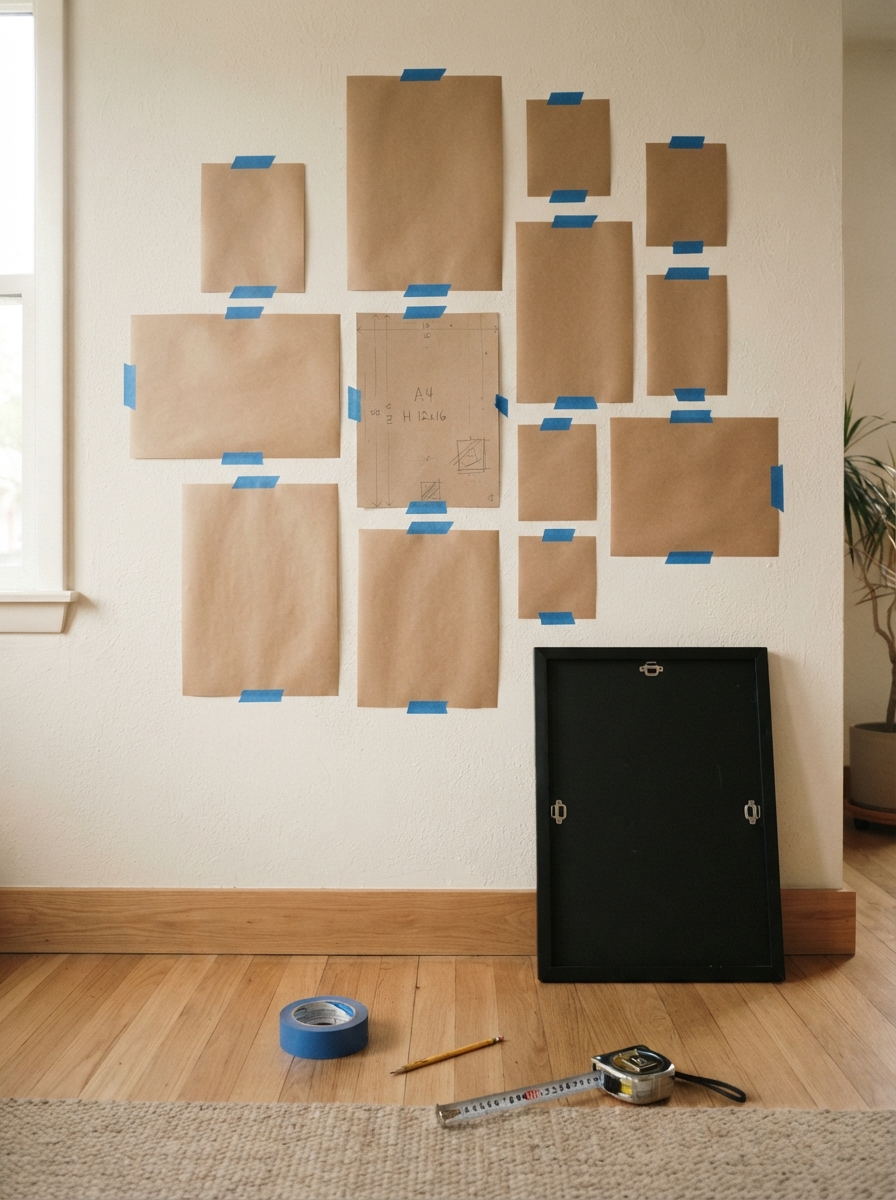
Measure each frame’s outer dimensions, not the print size or glass, and cut kraft paper or newsprint to those exact measurements. One sheet per frame. Label each cutout with the frame size and a name so you can match papers to frames without confusion. Then flip each frame face-down, find the hanging hardware on the back, measure how far down from the top edge it sits, and mark that exact spot on the paper template with an X. That mark is where your nail goes, which means you can drive the nail through the paper and hit the right spot every time.
This picture hanging layout method is one of the most reliable ways to transfer a floor plan to the wall accurately, especially when you’re working with five or more frames.
Floor mapping before you go to the wall
Tape off a rectangle on the floor that matches the wall area you’re working with, then arrange the paper cutouts inside it. Move pieces around until the composition looks balanced from above. Photograph the floor layout before transferring anything to the wall; you’ll reference that photo constantly as you hang. This step eliminates the most common gallery wall mistake, which is hanging pieces one at a time without visualizing the full grouping first.
Taping templates to the wall for final checks
Stick the labeled cutouts to the wall with painter’s tape, not regular tape, so you can reposition freely without damaging the surface. Once they’re up, step back at least 8 to 10 feet to assess the overall composition. Adjusting a paper template costs you nothing; adjusting a frame costs you a patched nail hole.
Choosing the right hardware for your wall type
Drywall: matching hardware to frame weight
For frames under 10 pounds, standard picture hooks with nails handle the job reliably. For the 10 to 30 pound range, snap toggle anchors or 3M CLAW drywall hangers rated up to 65 pounds give you the holding power you need. For anything over 30 pounds, drive a screw directly into a stud or install a French cleat. Plastic drywall anchors alone are not reliable above 15 pounds. Regardless of what the packaging claims, skip them for anything substantial.
Plaster and concrete: what changes
Plaster is more brittle than drywall and often backed by wood lath, which makes standard drywall anchors unreliable. Use molly bolts or toggle bolts instead, and drill pilot holes first to avoid cracking the surface. Concrete walls require masonry bits and masonry screws, specifically Tapcon-type fasteners, or sleeve anchors. French cleats mounted into masonry anchors are the most dependable option for heavier pieces on concrete.
Tools to have on hand
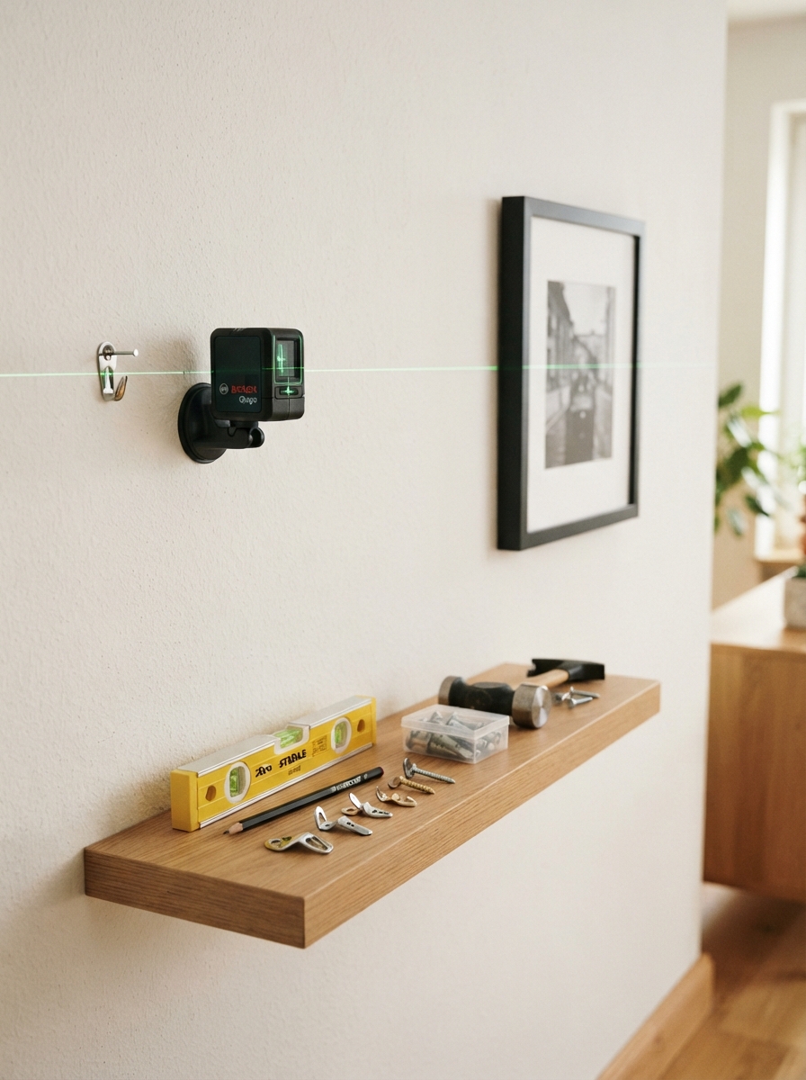
A stud finder, level, measuring tape, and hammer cover most standard hanging jobs on drywall. A level is especially important for wall art arrangement: a solo frame that’s off by even a few degrees draws the eye immediately, and a misaligned grid can throw off the entire composition. A power drill becomes necessary for plaster, concrete, or any frame that weighs more than 20 pounds. Having these tools ready before you start saves multiple trips to the garage mid-hang.
 Hanging Kit251 Pcs Picture Hanging Kit, Dual-Size Heavy Duty Hardware★★★★½ 4.7 (840)Check price on Amazon →
 PREXISO30 Ft Handheld Wall Laser Level, LED Rotatable Magnetic Base★★★★☆ 4.3 (605)Check price on Amazon →
 TrilancerPicture Hanging Strips Heavy Duty, 20 Pairs, Damage Free★★★★½ 4.4 (700)Check price on Amazon →
 Anchor KitSelf Drilling Drywall Anchors Kit with Screws, 3 Sizes★★★★½ 4.5 (598)Check price on Amazon →
Prices and availability change on Amazon. As an Amazon Associate I earn from qualifying purchases.
Apps that help you visualize the arrangement first
Free tools that actually work
WallDecor.io is a browser-based tool that offers exact-scale placement with precise measurements, making it a solid starting point for beginners who want to see their wall art arrangement at realistic proportions before committing. Picture Frame Generator (also called View in Room) is another free online option that maintains proper proportions and displays artwork at realistic scale relative to the room. Both tools perform best when you input your actual wall dimensions and frame sizes rather than dragging and dropping without measurements.
When a paid option makes sense
ArtPlacer is a paid tool with a free trial that offers augmented reality placement at real scale, worth the cost if you’re investing in multiple statement pieces and want near-certainty before buying. Wallnora is a freemium option that provides accurate scaling with realistic lighting to show how frames interact with the room’s natural light. The key limitation across all apps is the same: accuracy depends entirely on entering the correct wall and artwork dimensions. Drag-and-drop tools without measurement inputs are useful for inspiration, not for precise planning.
Room-specific tips to get the scale and mood right
Living room: anchor to the furniture, not the wall
The wall art arrangement in a living room should relate to the sofa or console, not the full wall width. Aim for the total grouping to span two-thirds of the furniture’s width below it. For a single statement piece, center it at 57 to 60 inches from the floor. For a multi-frame grouping, center the whole cluster at that height rather than centering individual pieces, this keeps the arrangement cohesive at eye level.
Hallways and staircase walls
Hallways are narrow, so vertical stacks or single-row horizontal arrangements prevent the space from feeling cluttered. On staircase walls, the arrangement follows the diagonal rise of the stairs; maintain consistent 2 to 3 inch gaps between frames while stepping each piece up in line with the stair angle. Mix frame sizes on a staircase wall to create rhythm, but keep a consistent finish throughout, whether that’s all black frames, all natural wood, or all brass, so the variety feels intentional rather than accidental.
Bedrooms and smaller spaces
Above a bed, a horizontal triptych or a single anchor piece flanked by two smaller frames creates balance without overwhelming the room. Smaller spaces read better with fewer, larger pieces than with many small frames scattered across the wall. In general, the same how to arrange wall art principles apply here as in any other room, scale down the number of frames, but keep your spacing rules and anchor-first approach consistent.
Gallery wall shopping list
- Matching frame set — one finish beats six mismatched ones
- Picture hanging kit — hooks rated above your heaviest frame
- Laser level — the difference between straight and nearly straight
- Damage-free strips — for rentals and light frames only
- Heavy-duty drywall anchors — anything over 10 lb needs them
- Painter\u2019s tape — for taping templates before you drill
Prices and availability change. Links open on Amazon.
Putting it all together
Good wall art arrangement comes down to a clear sequence: establish your spacing rules, choose a layout that fits your wall size, plan with paper templates on the floor and wall, select hardware that matches your wall type and frame weight, and preview the arrangement digitally before you drive a single nail. These steps work whether you’re hanging two frames or twelve, and none of them require a design background to execute.
Wall art arrangement is also forgiving. If a piece doesn’t look right once it’s up, rehanging takes five minutes. The worst outcome is a small nail hole and a better-informed second attempt. The principles in this wall art layout guide stay consistent across every room and every scale, so bookmark it before your next hang session and refer back when you’re ready to plan your next arrangement.
When you’re ready to tackle a full gallery wall with mixed frames, varying sizes, and a more complex picture wall arrangement, explore Aesthetic Nest Decor’s dedicated gallery wall layout guides for room-specific planning and deeper styling strategies.