
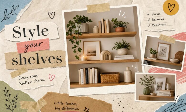
Most shelves don’t look bad because the owner has no taste. They look bad because no one taught them the rules. If your bookcase is holding a random mix of objects that never quite come together, that’s not a style problem, it’s a process problem. Shelf styling is a learnable skill built on a handful of repeatable formulas, and once you see how they work, you can’t unsee them.
At Aesthetic Nest Decor, we break down these shelf styling ideas room by room because the same principles that make a living room shelf feel curated also apply to your home office, your bedroom, and even that small floating shelf in the hallway. By the time you finish reading, you’ll have three to five ready-to-use formulas you can apply to any shelf in any room today.
The four shelf styling principles behind every intentional-looking shelf
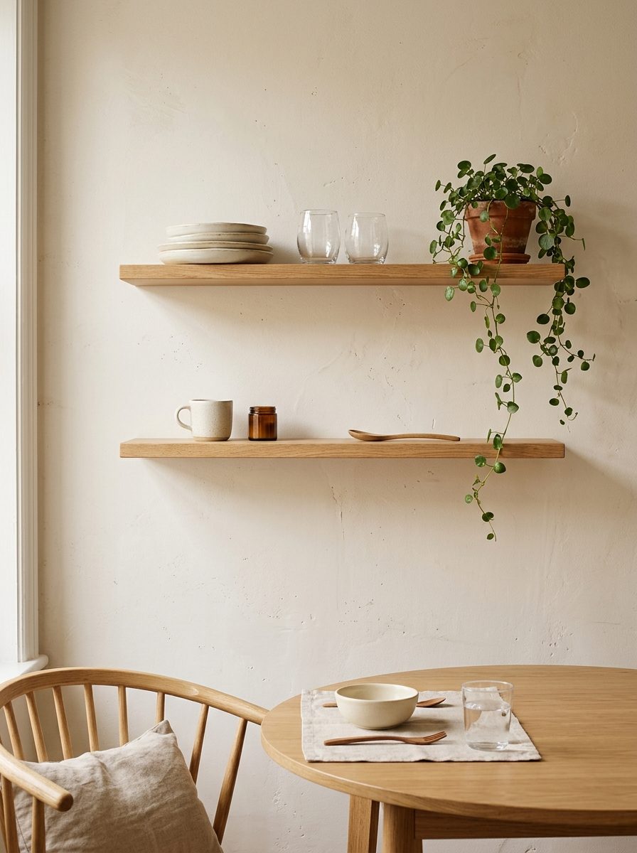
Before you pick up a single object, understand what separates a curated shelf from a cluttered one. These four principles are the architecture underneath every good-looking bookcase or open shelf decor arrangement. Get these right and the specific objects matter far less than you think.
Balance: visual weight, not perfect symmetry
Symmetrical shelves can read as stiff and formal in many interiors. Asymmetrical balance often feels more natural, designers typically favor distributed visual weight over strict mirroring. It means spreading visual weight so the shelf feels even without copying itself exactly. Taller objects and darker colors carry more visual weight, so they need to be offset by groupings or open space on the opposite side. A tall ceramic vase on the left reads as balanced when you have two stacked books and a small plant sitting together on the right.
Layering: building depth front to back
Shelves have three depth zones: back, middle, and front. When everything sits at the same depth, the result looks flat and staged. Lean framed art or prints against the back wall, place books and taller vases in the middle zone, and position smaller accents at the front edge. That layered, lived-in quality you see on well-styled shelves comes directly from using all three zones intentionally.
Negative space: the element most beginners skip
The most common beginner mistake is filling every inch of available shelf space. Empty space is not an unfinished shelf, it’s a design choice that draws the eye to what’s actually there. Aim for the 60, 70% fill rule: leave at least 30% of each shelf visually open. That breathing room is what makes the pieces you do display feel intentional rather than crammed in.
Mixing textures and materials
A shelf styled in one material type reads as flat, even if the individual pieces are beautiful. The goal is contrast: rough next to smooth, matte next to glass, organic next to structured. A few pairings that consistently work include a woven basket beside a smooth ceramic vase, a metal picture frame next to a linen-bound book, or a polished glass vessel beside raw wood. Those contrasts are what create visual interest from across the room.
How to start shelf styling from a completely empty shelf
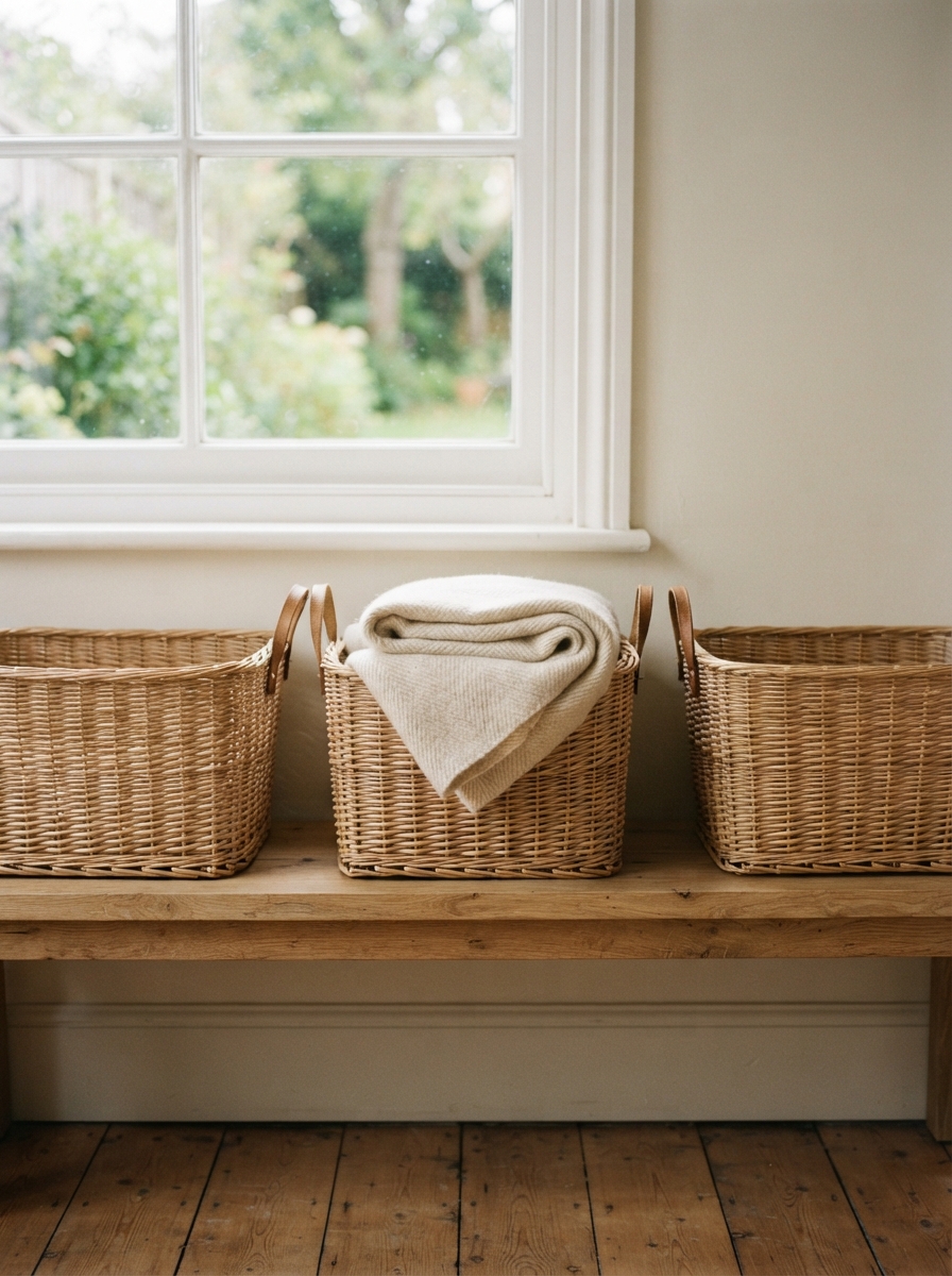
Most people try to rearrange what they already have, and that’s exactly why their shelves never improve. The right process starts with a blank slate, not a reshuffled version of the same clutter.
Step 1: measure, then sort before you touch anything
Measure the usable width and height of each individual shelf level so you know what sizes will actually fit before you start grabbing objects. Then sort everything you’re considering into three piles: books, decorative objects, and plants or organic elements. This prevents the grab-and-place trap that produces random-looking results and forces you to make intentional decisions before anything goes back on the shelf.
Step 2: place the largest items first, then fill in
Always start with the biggest or heaviest object on each shelf section and build around it. Large items on the lower shelves ground the entire unit and give the whole composition a stable base. Mid-sized items come next, followed by smaller accents. Interior stylists consistently recommend this order because starting with small pieces tends to make compositions feel cluttered, everything competes for attention before any hierarchy is established.
Step 3: group items into vignettes, not rows
A vignette is a small, intentional cluster of two to three objects that reads as a single unit. It works far better than lining items in a straight horizontal row because it creates distinct focal points across the shelf. Depending on the width of your shelf, you’ll typically fit two to three vignettes per level, with some breathing room between each group. That spacing is the difference between a styled shelf and a crowded one.
Shelf styling formulas that consistently work for beginners
These are the most repeatable formulas that interior stylists return to again and again. Pick one or two and apply them before inventing your own system. Once you’ve used them enough times, adjusting on instinct becomes natural.
The 60/30/10 fill ratio
This formula breaks down the shelf unit as a whole: 60% books or functional items, 30% decorative objects like vases, frames, and sculptures, and 10% empty space. The ratio applies across the entire bookcase, not necessarily per shelf, so some shelves can be heavier on books while others carry more decorative pieces. This prevents both the “too sparse” and “too stuffed” extremes that most beginners land in.
The odd-number grouping rule
Groupings of three or five objects read as more natural than even numbers. The visual logic is simple: odd-number groups have a clear center with flanking pieces on each side, which creates movement across the arrangement. Even groupings tend to split the eye in half with nothing to land on. Three items in varying heights (a tall vase, a medium book stack, and a small plant) will almost always look more dynamic than two items that function like bookends with nothing to anchor them.
The three-layer vignette formula
This is the most replicable bookshelf styling tip you’ll use: one dominant piece, one secondary piece, and one accent piece. The dominant piece is the largest element, a tall vase, an oversized framed print, or a large decorative object. The secondary piece comes in at a medium scale, such as a stacked set of books, a bowl, or a mid-sized plant. The accent is the finishing detail: a small candle, a dried stem, or a sculptural figurine. Vary this formula slightly across shelf levels so not every vignette looks like a copy of the one above it.
Room-by-room shelf styling ideas that translate to real homes
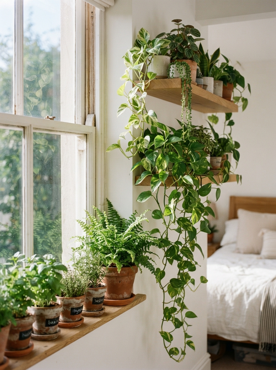
The same principles apply in every room, but each space has a different purpose and mood that should guide your object choices. For readers who want to go deeper on any single space, Aesthetic Nest Decor publishes room-specific styling guides covering everything from bedroom shelf setups to kitchen open shelving with more detail and visual references. Related reading: 35 aesthetic bedroom ideas for every style & budget (2026).
Living room shelves: more personality, more mix
Living room shelf styling carries the most visual weight in a home and benefits from the greatest texture variation. Use the two-to-three color rule: pull tones from the room’s existing upholstery, artwork, or rugs so the shelves feel connected to the rest of the space. Mix wood, ceramic, glass, and greenery freely. A strong starting vignette is three horizontally stacked coffee-table books with a ceramic vase on top and a small trailing plant beside them, grounded, layered, and effortlessly collected-looking.
Bedroom shelves: calm, cohesive, and intentional
Bedroom shelves should feel quieter than their living room counterparts. Stick to a tighter color palette, neutrals, soft earth tones, and one accent color. Pair that with fewer competing textures to create the restful atmosphere a bedroom needs. Avoid heavy, visually busy arrangements that make the eye work too hard before sleep. Many designers recommend keeping bedroom shelf groupings to around two to three items per level to maintain calm: a stack of books, a single candle, and one small plant is genuinely all you need.
Home office shelves: functional without being boring
Home office shelves often hold actual files, binders, or equipment, and that’s fine. The trick is grouping functional items inside decorative containers like baskets, boxes, or trays so they read as styled objects rather than utility clutter. Every shelf still gets at least one vignette anchor: a framed print, a small plant, or a sculptural object placed beside the practical items so the overall display feels intentional rather than purely utilitarian.
Choosing the right objects without overcomplicating it
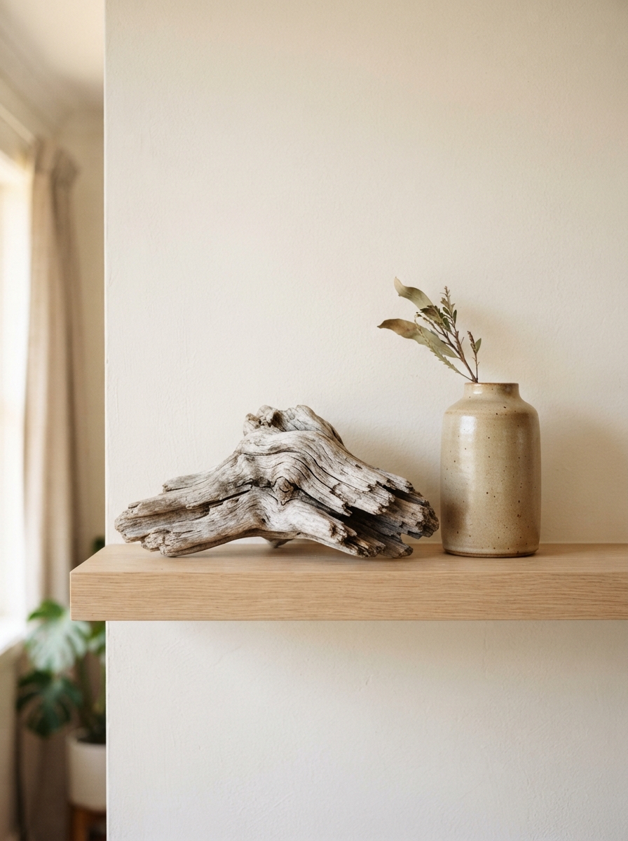
You don’t need to buy everything new. Most readers already own the right pieces, they just need a clear framework for combining them.
The item types every styled shelf needs
Five categories cover most situations: books for structure and height, vases or vessels in varying heights and materials, frames or art as back-layer anchors, plants or organic elements for softness and life, and small sculptural accents for detail and personality. Each shelf level should include at least two to three of these categories. Repeating one type across every shelf, all books or all ceramics, is what makes an otherwise attractive collection feel monotonous.
Proportions: one dominant, one secondary, one accent
Apply the dominant, secondary, and accent formula with a loose sense of scale: the dominant piece should clearly be the tallest or largest element in the vignette, the secondary piece a noticeably smaller counterpart, and the accent a true finishing detail. Mixing all three sizes within a single vignette creates immediate visual interest. These aren’t rigid measurements, they’re guardrails to keep your groupings from looking like a lineup of identical objects.
Where to source shelf decor without overspending
Target and IKEA are reliable starting points for affordable vases, faux plants, and frames that won’t look cheap. HomeGoods and TJ Maxx regularly stock discounted ceramics and unique sculptural pieces at a fraction of boutique prices. Thrift stores and Facebook Marketplace are where to find vintage frames, stacks of hardcover books, and one-of-a-kind pieces that give a shelf its personality. A well-styled vignette built from a mix of thrifted and new items can typically come together for $25 to $50 or less, depending on what you already own.
Shelf Styling Essentials
As an Amazon Associate we earn from qualifying purchases.
Put it into practice today
Here’s a quick shelf styling checklist of the core moves. Start with the four principles: balance, layering, negative space, and texture contrast. Clear the shelf completely before rearranging. Apply one of the repeatable formulas, the 60/30/10 ratio, the odd-number grouping rule, or the three-layer vignette. Then adjust your object choices for the room’s purpose and mood, and build each grouping from at least two to three item categories and size levels.
Shelf styling is iterative. Step back after your first pass, edit ruthlessly, and swap pieces rather than trying to nail it in one go. The best-looking open shelf decor is usually the result of multiple rounds of editing, not one inspired arrangement session.
Pick one shelf in your home right now, apply the 60/30/10 ratio and one vignette formula, and see how quickly the space shifts. When you’re ready to take on the next room, Aesthetic Nest Decor has the room-specific guides to walk you through it.