
As an Amazon Associate I earn from qualifying purchases. Some links in this post are affiliate links, at no extra cost to you.
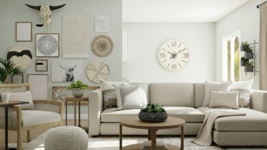
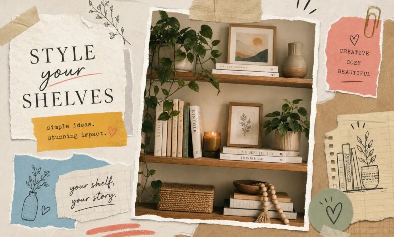
Most bookshelves don’t look bad because of the books. They look bad because of how the bookshelf decor is handled, or more often, not handled at all. The result is a shelf that reads as storage rather than a styled moment in the room: every inch filled, no breathing room, no visual rhythm. If you’ve ever stood in front of your bookcase and felt like something was off but couldn’t name it, this guide will fix that. At Aesthetic Nest Decor, we’ve broken down the exact formulas, product categories, and arrangement principles that separate a cluttered shelf from one that stops people mid-step. Aesthetic Nest Decor covers full reading nooks and home library walls in detail separately, start here and build outward.
The 2026 direction for bookcase styling has a name: “bookshelf wealth.” It’s calm, slightly moody, and deliberately restrained. Think fewer objects styled more intentionally, warm neutral tones, and noticeable empty space that signals curation rather than neglect. The most common mistake is filling every inch of shelf space, which flattens everything into visual noise. What you’ll learn here covers the balance rule, color coordination, layering techniques, ready-to-use bookshelf decor formulas, and a shopping breakdown so you can walk away and actually execute this.
The books-to-decor balance that makes or breaks a shelf
A well-styled bookshelf is not a bookshelf and not a display cabinet. It’s a deliberate mix of both. The general rule that interior designers return to again and again is the 60/40 guideline: roughly 60% of the visual space on any given shelf should come from books, and the remaining 40% should come from decorative objects and empty space. If you are buying books mainly for how they look on the shelf, our guide to decorative coffee table books covers choosing them by size and spine colour. That empty space isn’t laziness. It’s part of the design.
Why empty space is part of the design
When a shelf is packed from edge to edge, every item competes for attention and nothing wins. When you leave breathing room between groupings, each object gets to exist as part of a composition rather than disappearing into the crowd. Picture a shelf completely stuffed with paperbacks versus the same shelf with three neat sections of books, a small plant in the gap, and a few inches of open space on one end. The second version feels considered. That gap is doing work.
Negative space is especially important in 2026’s styling direction, where the goal is a shelf that feels calm and collected rather than maximalist. Less truly is more here, and the restraint is what communicates good taste.
The 60/40 guideline for books and objects
Applied practically: if a shelf has six units of space, dedicate three to four of those to books, a mix of upright runs and flat stacks, and reserve two to three for decorative objects and open air. This is a guideline, not a rigid rule, and some shelves lean even more toward restraint in 2026. The key is that both books and objects appear, and that some space is left intentionally unfilled.
Color coordination that makes the whole shelf feel intentional
Color is one of the fastest levers you can pull to make a bookshelf look styled. Two strategies work particularly well together: organizing books by spine color, and building a consistent palette for your decorative accents. When these two things align, the shelf feels cohesive even before you add a single plant or vase.
Grouping books by spine color
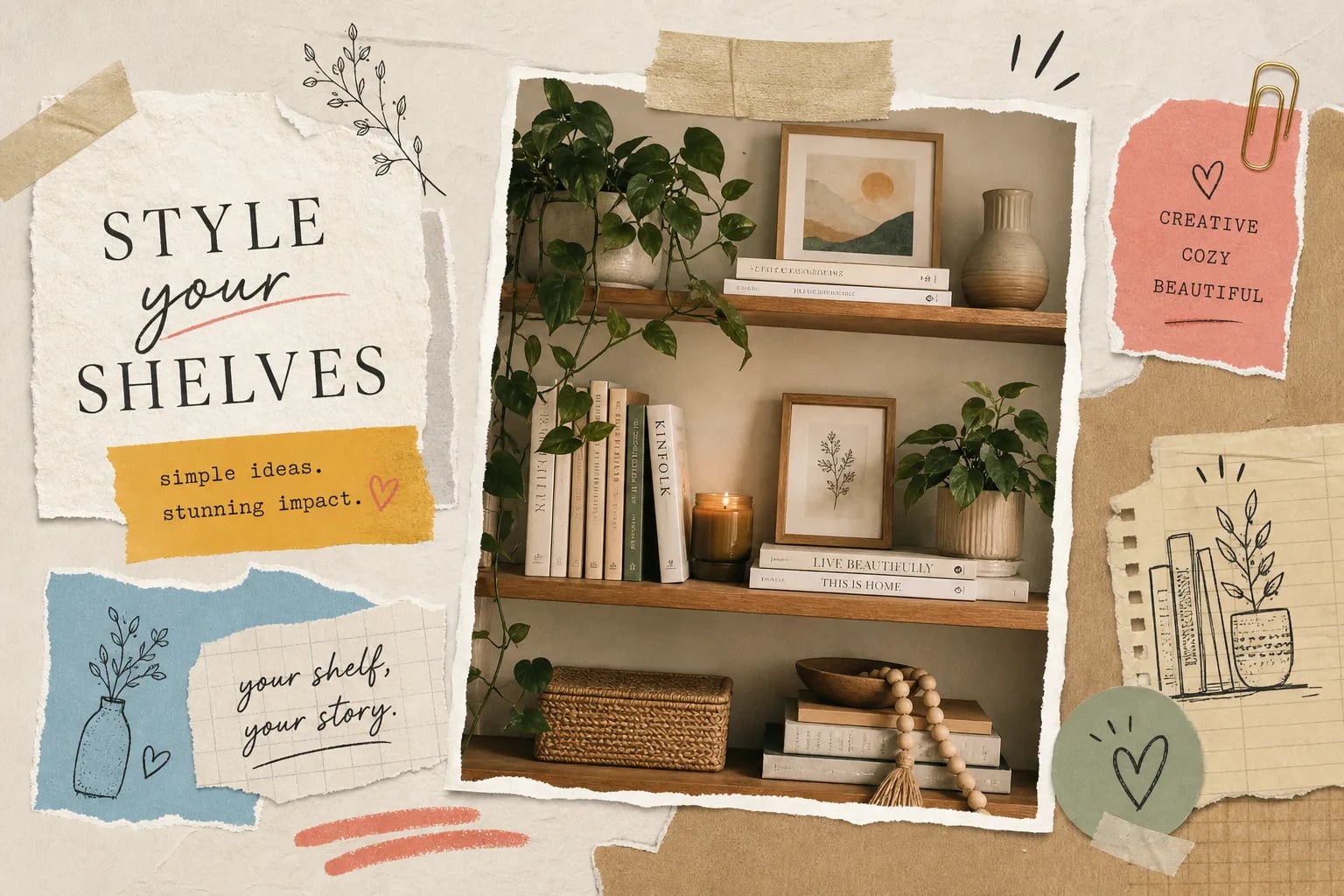
Pull every book off the shelf and sort them into color families before putting anything back. Arrange them in tonal groups rather than strict rainbow order: warm whites and creams together, muted greens together, dark navy and black together. This technique is especially effective if you have a lot of paperbacks with varied cover designs, because the color grouping imposes visual order even when the titles are completely different. You don’t need to reorganize by genre or author. Color does the heavy lifting.
Building a neutral base with intentional accent pops
Choose two to three colors for your decorative objects and stick to them across every shelf. The strongest palette direction for 2026 is warm neutrals, specifically cream, tan, warm white, and terracotta, with one accent color layered in. Brass, sage green, and deep olive all work well against this base. Apply that palette to your vases, bookends, trays, and any plants so every element feels like it was chosen together. The goal is harmony, not a furniture-showroom match.
Layering height, texture, and depth for a designer finish
Layering is what separates a shelf that looks finished from one that looks flat. There are three dimensions to work with: height variety, texture contrast, and front-to-back depth. When all three are present on a shelf, the arrangement reads as three-dimensional and intentional even when the individual pieces are simple and inexpensive.
How to mix tall, medium, and small items
Every shelf should include at least one tall item, one medium item, and one low or short item. This gives the eye movement, which is what creates visual rhythm. A tall ceramic vase, a mid-height framed print leaning against the back, and a small candle or stone in front is a simple example that works at almost any budget. When everything on a shelf sits at the same height, the display reads as a flat line rather than a composition. Breaking that line is the simplest upgrade you can make.
Adding depth by layering art and objects front to back
Lean a small frame or print against the back wall of the shelf, then place a smaller object directly in front of it. This creates a foreground-and-background effect that makes the shelf feel three-dimensional rather than flat. Mini art prints, small trailing plants, and sculptural decorative shelf accents placed at staggered depths all work well for this technique. The overlap is intentional: let a vase sit slightly in front of a frame, or let a small bowl partially overlap a stack of books.
Bookshelf decor formulas you can follow right now
Formulas take the guesswork out of arranging. Instead of moving objects around until something feels right, you start with a proven structure and fill it in with your own pieces. Here are three of the most beginner-friendly shelf decor ideas, each of which works across a wide range of home styles.
The triad vignette
This is the most versatile formula and the best place to start. Group three items together: one tall element, one medium element, and one shorter object. A practical example is a small potted plant or trailing ivy as the tall piece, a 5×7 framed photo leaning against the back as the medium element, and a small ceramic bowl in front as the shorter anchor. This formula scales up or down for any shelf width, the triangular arrangement guides the eye along a natural path, and you can repeat a version of it across multiple shelves for a unified look.
The horizontal stack and topper
Stack two to four books flat and place one decorative object directly on top. Three coffee table books or art books with a small matte vase or a single candle on top creates a completely different visual rhythm compared to all-vertical shelving. This formula is especially useful for breaking up a shelf that has too many upright book runs, because it introduces a horizontal line that the eye reads as intentional variety. Keep the topper small and in your chosen accent palette.
The book, greenery, and art formula
Arrange a run of upright books on one side of the shelf, place a small plant in the middle (a succulent, trailing pothos, or compact fern), and lean a small frame behind or beside the plant. The combination of organic texture from the plant, the structured block of books, and the personality of artwork is reliably pleasing and works in almost any home style. This formula is the most forgiving because the plant fills in wherever the arrangement needs softness, which means even imperfect execution tends to look good. You will find more ideas in small laundry room decor ideas that look as good as they work.
The best bookshelf decor accessories to buy in 2026
The 2026 bookcase decor aesthetic is built on a short list of specific accent categories. Getting the right types of pieces matters more than how much you spend, because a $12 terracotta vase in the right spot will always outperform a $60 piece that doesn’t fit the palette or scale.
Trending shelf accents this year
The dominant bookcase accessories this year are matte ceramic vases, small sculptural ornaments, one trailing plant per shelf, sleek metal or stone bookends, and natural-texture objects like driftwood, woven seagrass baskets, and brass candleholders. The through-line across all of these is an earth-tone palette and a tactile, handmade quality. The trend is explicitly away from lots of small decorative objects and toward fewer, more intentional pieces that hold their own visually. Vintage and patinated accents, including thrifted hardbacks with interesting covers displayed spine-out, are also strong this year.
What to expect to spend at every budget level
A fully styled single shelf can look polished for $40 to $60 if the pieces share a consistent color palette. Here’s a practical breakdown of what falls into each tier:
- Budget (under $20 per piece): Small ceramic or terracotta vases, tabletop succulents, simple metal bookends, taper candles in earth tones
- Mid-range ($20 to $50 per piece): Statement bookends, small framed prints, woven seagrass trays, quality faux trailing plants that hold up over time
- Splurge ($50 and up): Handmade ceramic sculptures, large statement vases, brass candleholders, artisan pottery
Retailers across all price points carry solid options, particularly for matte ceramics, bookends, and faux greenery. The key is buying fewer bookshelf decor pieces in a cohesive palette rather than filling a cart with variety.
Styling narrow shelves and small-space bookcases
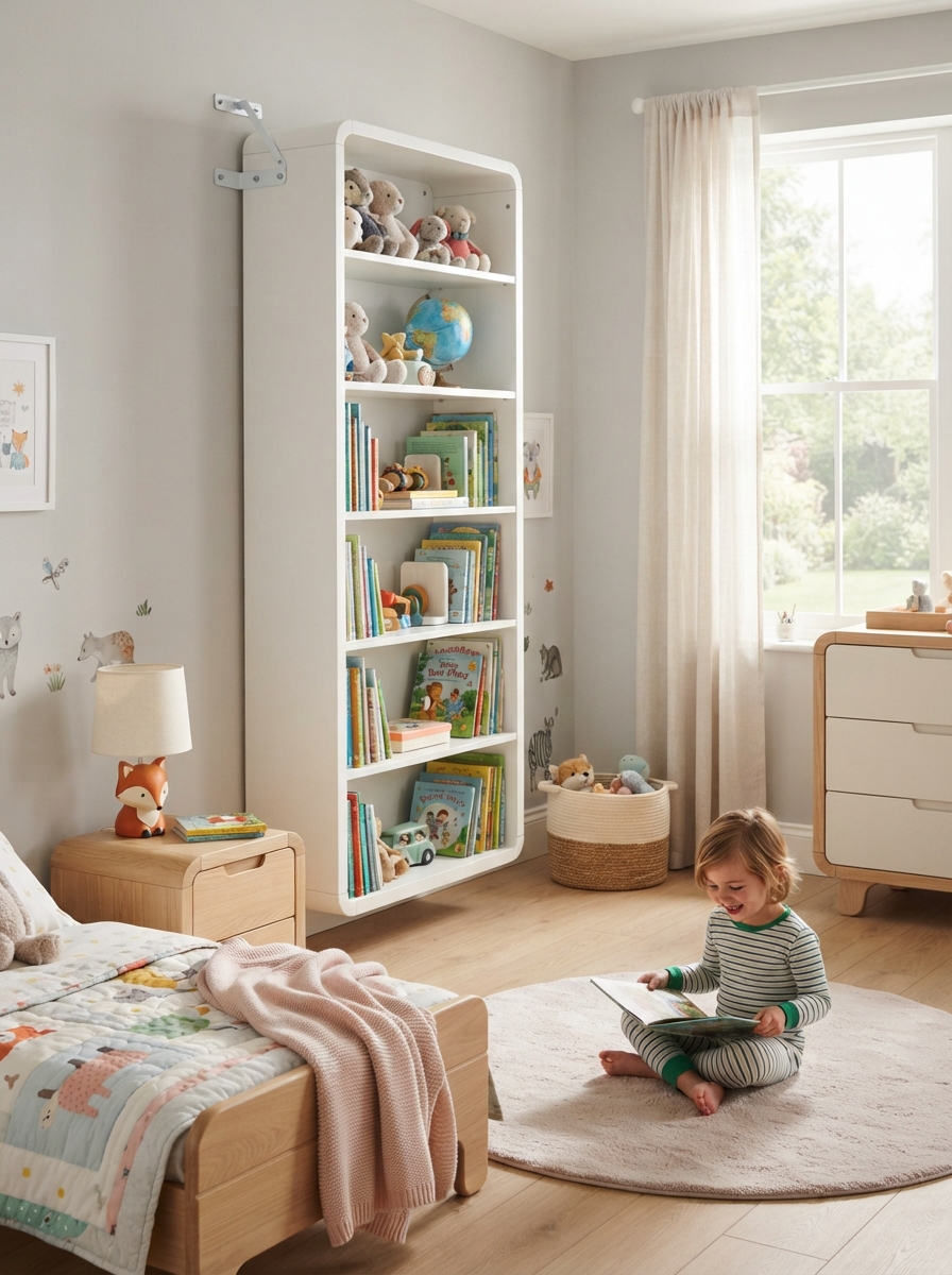
The same principles apply to narrow shelves, but the margin for error is smaller. When shelf depth is limited, bulky pieces overwhelm the space immediately, so every choice needs to be deliberate. The good news is that restraint, which is the whole point of the 2026 direction anyway, works naturally in small-space bookshelf decor.
Choosing slim, vertical pieces for tight shelves
Narrow shelves need tall, slim objects rather than wide or bulky ones. A thin ceramic bud vase with a single stem, a small leaning frame, and a compact succulent take up far less visual and physical space than a wide tray or an oversized sculpture. Going vertical also draws the eye upward, which makes a small or low-ceilinged room feel taller.
The single-formula rule for narrow shelves
For shelves under 10 to 12 inches deep, stick to one formula per shelf consistently rather than mixing approaches. The most practical formula for tight shelves is one upright book run, one small organic element (a plant or a smooth stone), and one slim decorative object with visible space between them. That’s it. The restraint is exactly what makes a small shelf look intentional rather than crowded, and it’s far easier to execute than a more complex arrangement in a limited space.
Start with one shelf this weekend
A well-styled bookshelf doesn’t require a big budget or a design background. It requires a consistent color palette, a formula applied across each shelf, and the confidence to leave some space empty on purpose. The balance rule gives you structure, the layering principle gives you depth, and the formulas give you a starting point so you’re not arranging and rearranging with no anchor.
Pick one shelf, apply one bookshelf decor formula from this guide, and see how it looks before touching the rest of the bookcase. The triad vignette is the easiest entry point: pull three books, add one small plant, and lean a small frame behind them. Step back. You’ll immediately see the difference that a formula and some breathing room make.
If you want to take this further and style a full reading nook, home library wall, or built-in bookcase, Aesthetic Nest Decor has dedicated shelf styling and home library content that walks through each of those scenarios in detail. The same bookshelf decor principles scale up beautifully when you know what you’re working with.