
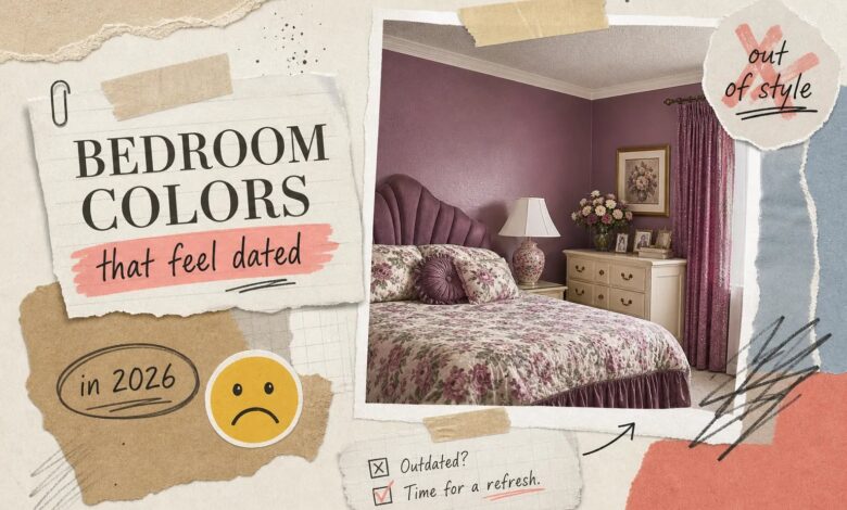
You painted your bedroom three years ago, chose a color that felt safe and stylish at the time, and now every time you walk in, something feels slightly wrong. The furniture hasn’t changed. The bedding is fine. But the room just doesn’t feel right anymore. Often, the wall color is the major factor, paint shades age, and bedrooms are where dated colors are most obvious because you spend time there with your guard down, noticing things you’d overlook in a busy kitchen or entryway.
As an Amazon Associate I earn from qualifying purchases. Some links in this post are affiliate links, at no extra cost to you.
If you’ve been wondering what are the outdated bedroom colors for 2026, you’re asking exactly the right question. Knowing which bedroom paint colors have crossed into tired territory is just as valuable as knowing what’s trending, avoiding the wrong shade saves you a repaint two years from now. At Aesthetic Nest Decor, we track these shifts constantly across bedroom styling guides, and this year the pattern is hard to miss. Below are 10 specific shades that have crossed into dated territory, grouped by type, followed by what designers are reaching for instead.
What Are the Outdated Bedroom Colors for 2026? The 10 Shades to Avoid
These bedroom colors to avoid in 2026 fall into three clear categories: cool neutrals that have become builder-grade defaults, washed-out pastels that don’t survive real-world lighting, and saturated accent shades that peaked too fast to age gracefully. Here’s the full list before we dig into each one.
If you are rethinking the palette anyway, it is worth seeing the whole picture first — our guide to 35 aesthetic bedroom ideas across six styles shows how color choices play out in real rooms.
- Cool flat gray
- Stark icy white
- Greige
- Icy blue
- Dusty blush
- Millennial pink and high-saturation pink variants
- Forest green accent walls
- Deep navy
- Dark maroon
- Mustard yellow and chartreuse
Cool Grays, Icy Whites, and the Greige Problem
This trio ruled American bedroom walls for most of the 2010s and into the early 2020s, and that widespread adoption is exactly why they now feel exhausted. When a paint color ends up in virtually every spec-built home and rental unit across the country, it stops reading as a design choice and starts reading as a default. That’s where cool gray, icy white, and greige all landed.
1. Why Flat Gray Feels So Exhausting in a Bedroom
Cool, flat grays absorb very little warmth and tend to look lifeless under both natural daylight and evening lamp light. In north-facing bedrooms with limited natural light, the problem compounds fast: the wall can shift toward looking blue, violet, or simply dingy rather than clean and neutral. Color psychology research links environments dominated by cool, achromatic tones to feelings of low energy and visual tension rather than calm, the opposite of what a bedroom needs. Add in how thoroughly cool gray saturated builder-grade homes nationwide, and the color now signals “nothing personal” more than any design intention.
2. Stark White, One of the Most Common Outdated Bedroom Colors for 2026
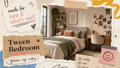
There’s an important distinction between a dated stark white and a genuinely fresh off-white. Stark gallery white reads as sterile in a bedroom, particularly when there aren’t enough warm textiles and natural materials to counteract it. Without warmth built into the undertone, the room feels more clinical than restful. Trend coverage from sources including Homes & Gardens and Good Housekeeping consistently places icy white among the bedroom palette mistakes to leave behind this year. More on that in tween bedroom design ideas that feel grown-up.
3. Greige: The Neutral That Tried Too Hard
Greige became a cliché precisely because it tried to be everything at once, neutral enough to offend no one, interesting enough to feel styled. Many trend reports now describe it as feeling tired in most bedroom contexts, with designers increasingly favoring warmer, more intentional neutrals that commit to an undertone rather than straddling two.
Pastels and Pinks That No Longer Hold Up
The soft pastel wave that swept bedrooms over the past several years was fueled by social media aesthetics and easily accessible paint options. Pastels aren’t inherently wrong for bedrooms. The specific versions that went viral, popular icy blues and sugary blush pinks, have a washed-out, flat quality that doesn’t age well in real lighting conditions. These are among the most frequently cited outdated bedroom palettes in 2026 trend guides.
4 & 5. Icy Blue and Dusty Blush: The Bedroom Pastel Problem
These two shades look polished in styled photo shoots with professional lighting and curated props. In an actual bedroom, under real-world conditions, the result is different. Icy blue can feel cold and clinical in low light, especially in the evening when most bedrooms rely on warm lamp light that has no interest in flattering a cool-toned wall. Dusty blush sits in an awkward middle ground between vintage and trendy that reads as neither by 2026.
Both shades also pair poorly with the warmer, earthier decor materials dominating the market right now. Natural linen, rattan, warm wood tones, and ceramic accents all fight against washed-out pastels rather than complementing them.
6. Why Millennial Pink and Its Variants Are Aging Out Fast
The pink bedroom trend moved fast through its lifecycle, amplified by pop culture moments and social-first decorating content. Sugary, high-saturation pinks feel more like a moment than a considered design choice, and that’s the fundamental problem with trend-driven paint colors: the faster they rise, the faster they date. Even softer blush iterations are now being replaced by warmer, clay-adjacent pinks with more brown or peach in the undertone. Those shades read as far more timeless because warmth is built into the base rather than sitting in that cool, faded middle zone.
Dark Accent Colors That Peaked Too Soon
Dark, moody bedrooms had a genuine moment, and the trend made sense in context. Forest green, deep navy, and dark maroon feature walls created drama and visual depth that felt intentional and sophisticated. Mustard yellow and chartreuse joined the mix as bolder statement choices. The problem with all of these shades is that they became too ubiquitous too fast, and now they read as “2021” rather than timeless.
7, 8 & 9. Forest Green, Navy, and Deep Maroon Walls: Why They’re Fading
These saturated accent colors work in theory but require significant commitment in furniture, lighting, and textiles to avoid looking heavy and unresolved. Many bedrooms used them as standalone statement walls without the layering needed to pull them off, which is why the execution so often fell flat. By 2026, the palette has shifted toward muted versions of green and earthy warm tones that feel more considered. The moody bedroom look isn’t dead; it’s just moved toward shades with warmth in the base rather than pure saturation.
10. Mustard Yellow and Chartreuse: Fast Movers with a Short Shelf Life
Highly saturated yellows and yellow-greens hold up fine as accessories and accent pieces. Scaled to a bedroom wall, they struggled. Chartreuse in particular reads as a very specific cultural moment, and that association makes it hard to wear gracefully as the years pass. These are among the bedroom palette mistakes designers flag most often in 2026 because their brightness makes them harder to update without a full repaint. When your wall color requires a complete do-over to feel fresh, it was never a timeless choice to begin with.
Why These Colors All Feel Dated Right Now
This isn’t simply a trend cycle rotating out old colors to make room for new ones. The shift happening in 2026 reflects a broader cultural move toward warmth and psychological grounding. Trend coverage from Good Housekeeping, Homes & Gardens, and Martha Stewart points to the same underlying driver: people want their bedrooms to feel like a retreat, not a showroom, and that’s requiring a fundamental rethink of what “neutral” and “serene” actually mean in a paint color.
Cool grays and bright whites were associated with aspirational minimalism during a very specific cultural moment. As that aesthetic became overused, people began craving warmth, texture, and personality in their spaces. Color psychology research links periods of overstimulation to a preference for grounding, earthy tones over polished, clinical ones, and that psychology shows up directly in what’s happening to bedroom paint choices right now. See also: 15 small bedroom storage ideas that maximize space.
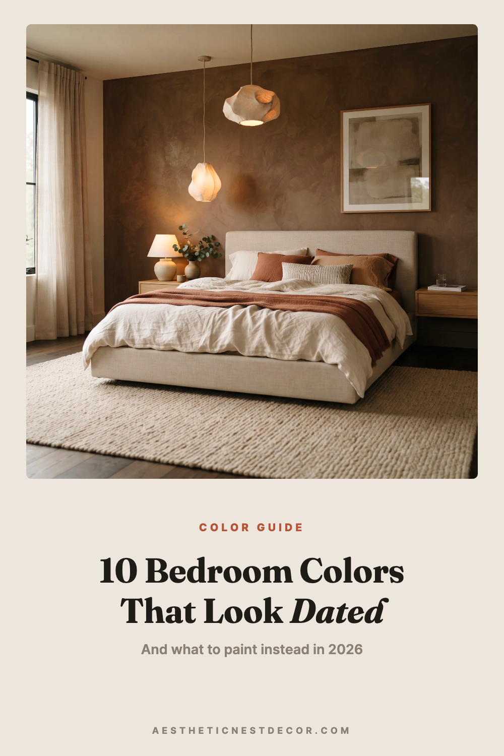
Lighting plays a role too. Bedrooms typically cycle through natural daylight, afternoon shadow, and warm artificial light every single day, and cool undertones in gray and white are particularly unforgiving under those conditions. The same shade that looked clean and crisp in the paint store can read as dull, greenish, or flat under a warm bedside lamp. Cool flat colors fail in at least one of those conditions, often the one that matters most, when you’re actually in the room.
What Bedroom Colors Actually Feel Fresh in 2026
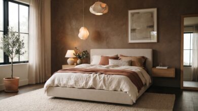
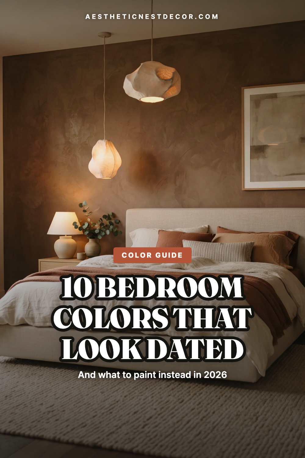
The replacement palette is genuinely livable, which makes this an easier transition than it might seem. Benjamin Moore’s 2026 Color of the Year, Silhouette AF-655, is a rich espresso brown with charcoal undertones that reads deep and cocooning under warm bedroom lighting. Sherwin-Williams’ Universal Khaki points in the same earthy, warm direction. Both reflect where the industry is landing: grounded and warm rather than cool and clinical.
Creamy Off-Whites, Warm Taupes, and Mushroom Tones
The key distinction here is undertone. Benjamin Moore’s Swiss Coffee OC-45, White Dove OC-17, and Pale Oak OC-20 all bring warmth without heaviness, exactly what the cold whites and flat grays couldn’t deliver. Mushroom tones, which sit between greige and warm brown, offer depth without the saturation that dates quickly. These shades replace greige without falling into the same trap because their undertone reads as intentional rather than cautious.
Clay, Terracotta, and Earthy Brown as the New Bedroom Palette Anchors
Earthier shades are connecting bedrooms to a broader design shift toward natural materials, handmade textures, and organic shapes. Clay and terracotta bring color with warmth already built into the base, which means they work with most bedroom lighting conditions rather than fighting against them. Silhouette AF-655 offers moody depth without the cold heaviness of charcoal gray; under warm evening lamps, its brown side comes forward and the room reads as intimate and cozy rather than dramatic. These shades also pair far more naturally with linen, natural wood, rattan, and ceramic accents, which makes styling the rest of the room significantly easier.
Getting Your New Palette Right: Finish, Undertone, and Pairing
Even a well-chosen color can look off if the finish is wrong or the undertone clashes with the room’s lighting. The finish-light relationship matters more than most people realize. Matte absorbs light and creates a soft, velvety effect that feels cozy rather than clinical, making it a strong choice for bedrooms with an enveloping, cocoon-like feel.
Eggshell adds a slight sheen that suits dimmer bedrooms needing a little reflectivity without tipping into gloss, and because it’s easier to wipe down, it’s the practical default many designers recommend for most bedroom walls. High-gloss on large bedroom walls reads as dated in 2026 because it makes even good colors feel over-polished and restless, the opposite of what a bedroom needs. For more on this, see our bedroom guide.
Undertone is equally direct: warm undertones suit most bedroom lighting conditions because they work with warm lamp light rather than against it. Cool undertones can amplify and shift in unexpected directions under warm bulbs, which is a significant part of why cool gray and icy white deliver such inconsistent results in real bedrooms. Before committing to a new color, test a large swatch and check it in the morning light, afternoon light, and under your evening lamps. All three conditions matter.
Execution is where most people drop the ball after choosing a good wall color. A creamy warm white paired with cool-toned gray bedding and chrome hardware can still look off. Warm walls need grounded, natural textures to complete the look: linen, wool, wood, clay, and woven materials. At Aesthetic Nest Decor, our color-specific bedroom styling guides include decor pairings already matched to current 2026 palettes, so you can see the full picture rather than piecing it together on your own.
Time to Take Stock of Your Bedroom Walls
The most common outdated bedroom colors for 2026 share a clear pattern: they’re either too cool, too saturated, or too trend-specific to age gracefully. Cool grays, icy whites, greige, washed-out pastels, and dark saturated accent walls all served a purpose in their moment, but that moment has passed. The good news is the replacement palette is genuinely easier to live with, warmer, earthier, and more forgiving across different lighting conditions than the shades it’s replacing.
Picking the right color is only part of the equation. Finish and undertone matter just as much, and getting both wrong can make a good shade look as dated as the ones you’re trying to leave behind. Look at your current bedroom walls and ask yourself honestly: is that color actually working for the space, or are you just used to it? If you have to think about it, you probably already know.
Bedroom repaint shopping list
- Paint sample pots — test on two walls before committing
- Paint color fan deck — see undertones side by side
- Painters tape — the difference between crisp and messy
- Paint roller set — a good roller changes the finish
- Wall primer — essential over dark or bold colours
- Canvas drop cloth — reusable, better than plastic
Prices and availability change. Links open on Amazon.
FAQs: What Are the Outdated Bedroom Colors for 2026?
Which paint colors are most dated in bedrooms right now?
The most commonly cited outdated bedroom colors for 2026 are cool flat grays, stark icy whites, greige, icy blue, dusty blush, millennial pink, forest green accent walls, deep navy, dark maroon, and high-saturation mustard or chartreuse. These shades share a common flaw: they’re either too cool-toned, too trend-specific, or too overexposed to read as intentional design choices in 2026.
What colors are replacing the outdated bedroom palettes in 2026?
Designers and major paint brands are favoring warm, earthy, and grounded tones. Benjamin Moore’s Silhouette AF-655, creamy off-whites like White Dove OC-17, warm taupes, mushroom tones, clay, and terracotta are all gaining traction as the new bedroom standards. These shades perform well across varied lighting conditions and pair naturally with the organic materials dominating current home decor.
Is greige still a good choice for a bedroom?
Greige has shifted from stylish to tired in most contexts. Many trend reports now describe it as indecisive rather than refined. If you want a neutral that feels current, look for warm taupes or mushroom tones that commit to a warm undertone rather than splitting the difference between gray and beige.
Does paint finish matter as much as color when updating a bedroom?
Yes. Finish affects how color reads across different lighting conditions. Matte works well for a cocooning feel; eggshell is a practical go-to for most bedrooms. High-gloss on large walls reads as dated and over-polished regardless of the color underneath.